Traction
Traction was a running app I worked on during my senior year at Drexel University. The idea was to create an experience that could help beginner runners become experts over time. Alongside a few of my classmates, we designed and developed this app over the course of several months.
Link to the final build is coming soon.
Context & Challenges
Traction was our senior project, intended to test our skills in UX, UI design, web development, teamwork, and leadership. The goal was to create a high-fidelity, coded prototype to showcase to the public in June. I was the primary developer for the demo, but I contributed to the UX and UI throughout the process. We had about eight months to complete the project.
Process & Insights
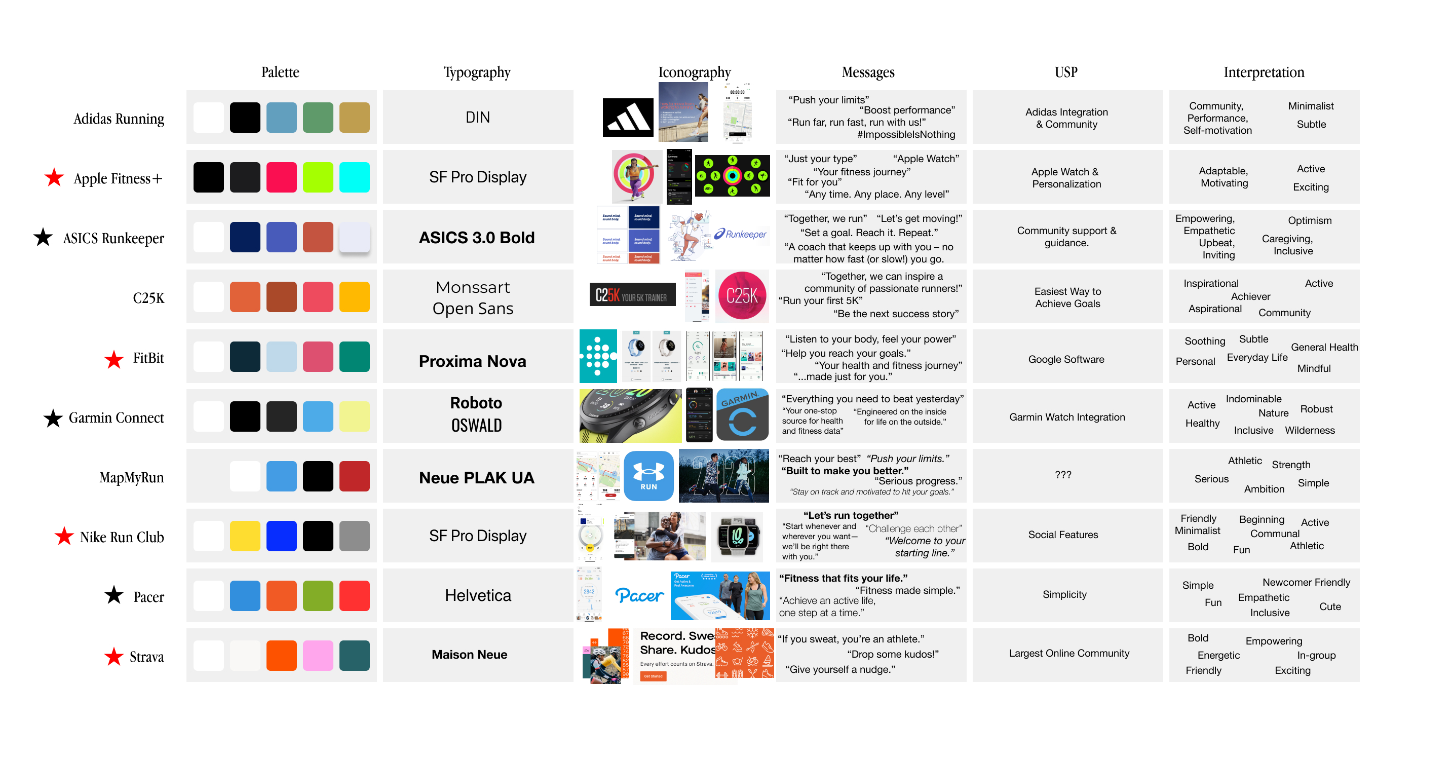
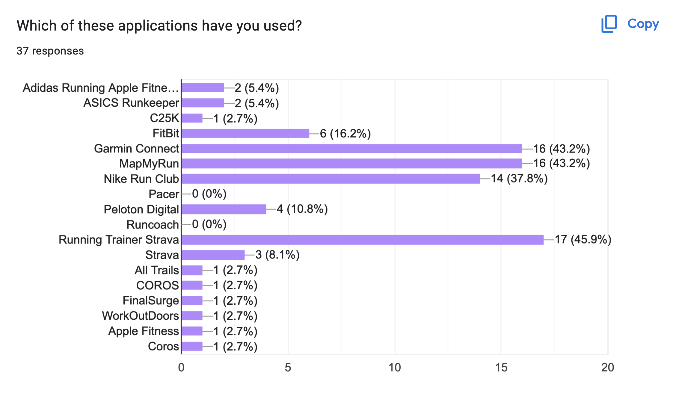
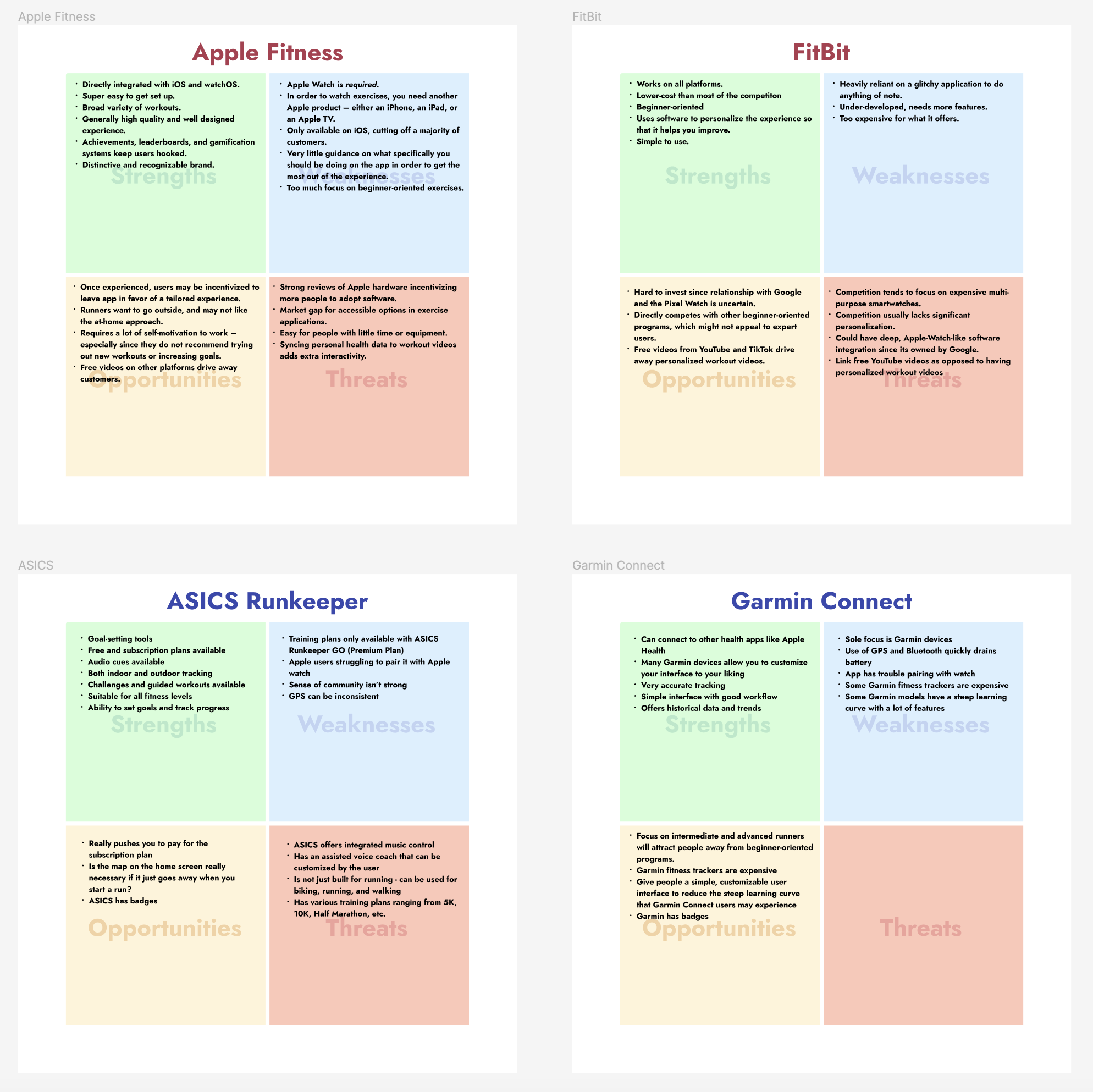
I started by conducting a competitive analysis of the marketplace. I paid close attention to fitness apps that had a strong brand identity and are tailored for beginner exercisers. We realized that there were two kinds of running apps – “victory” apps with a bold personality, and “wellness” apps with an empathetic personality. Additionally, “victory” apps were designed just for pros, and “wellness” apps were only designed for beginners.
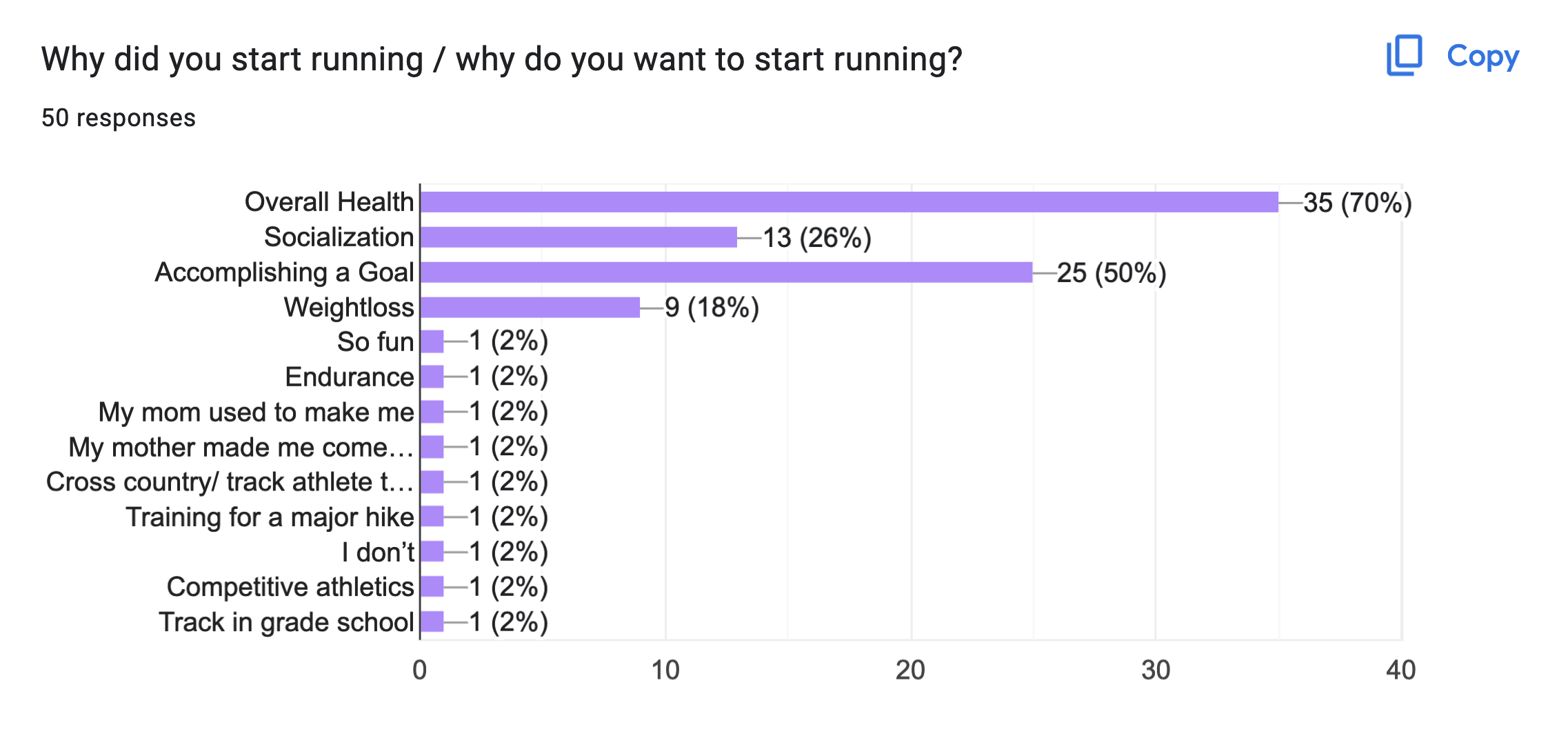
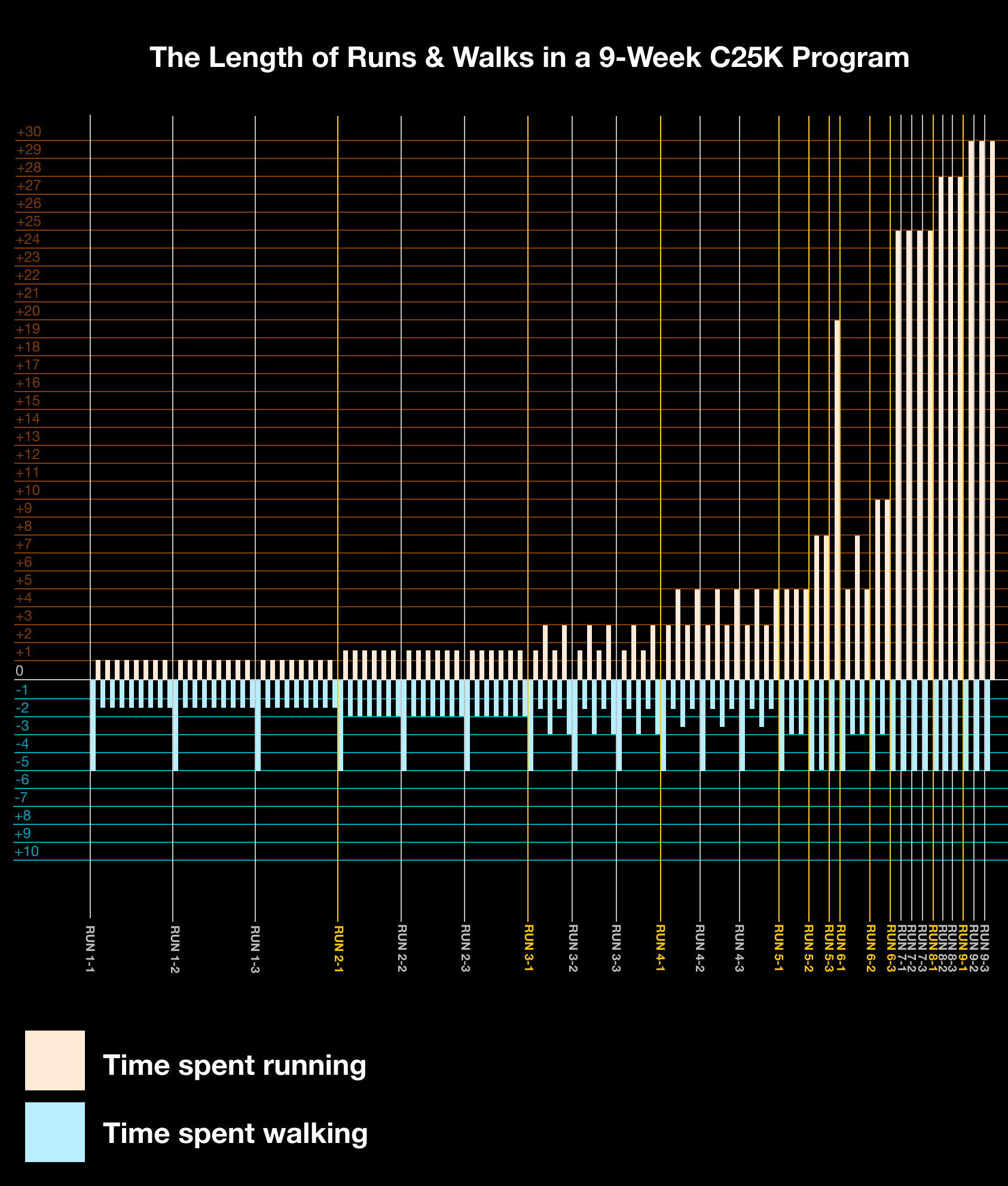
Since we knew this was going to be a running app, I researched different running programs to learn more about how they are structured for beginners.
After discussing the research we conducted as a team, we decided that the best approach for this app would be to create a solution that focuses on beginners who strive to become pros.
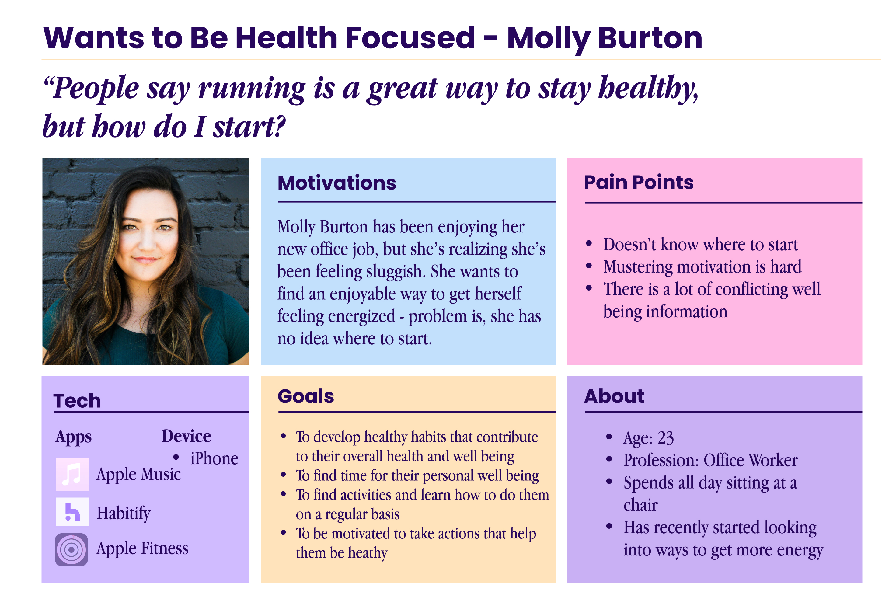
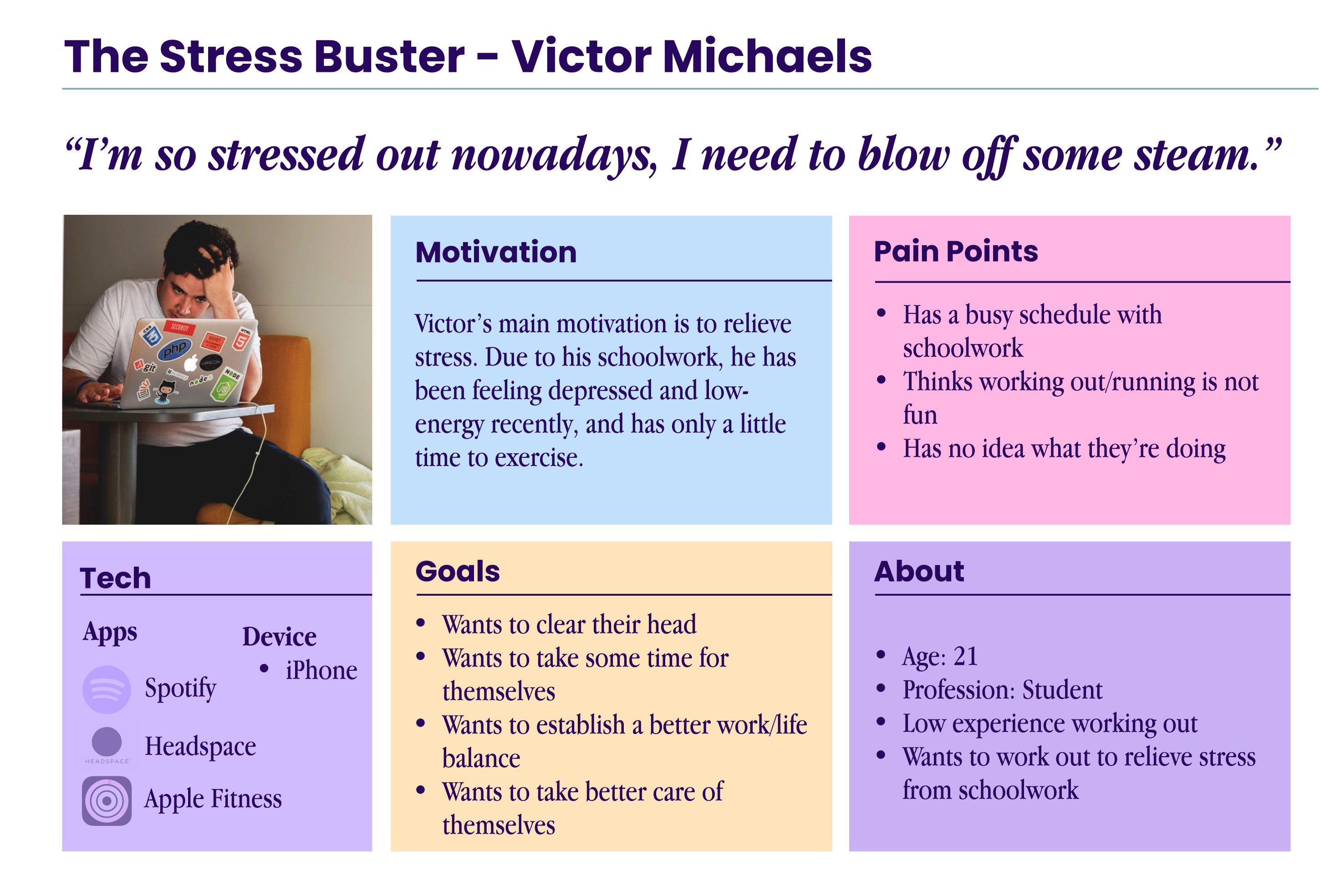
Together, we performed an affinity mapping exercise and created two user personas based on interview data.

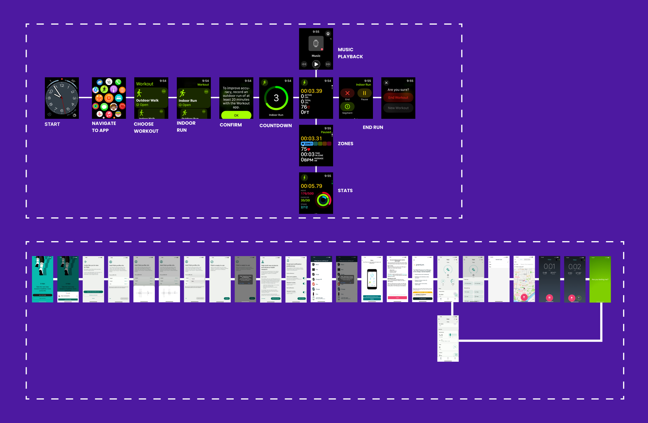
I conducted a SWOT and Task Flow analysis on two of our major competitors to help decide what the essential features should be.
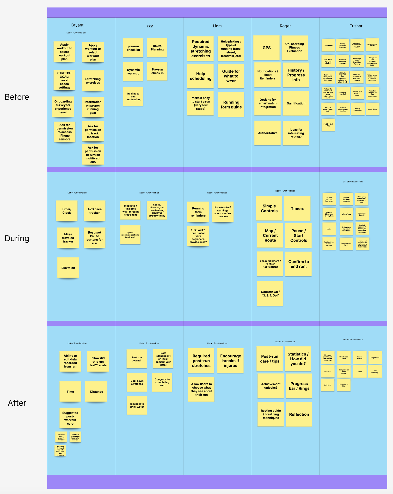
Each of us came up with a feature list for the app. We compared the lists, and decided that our app's main focus should be on its customization features and reward system.
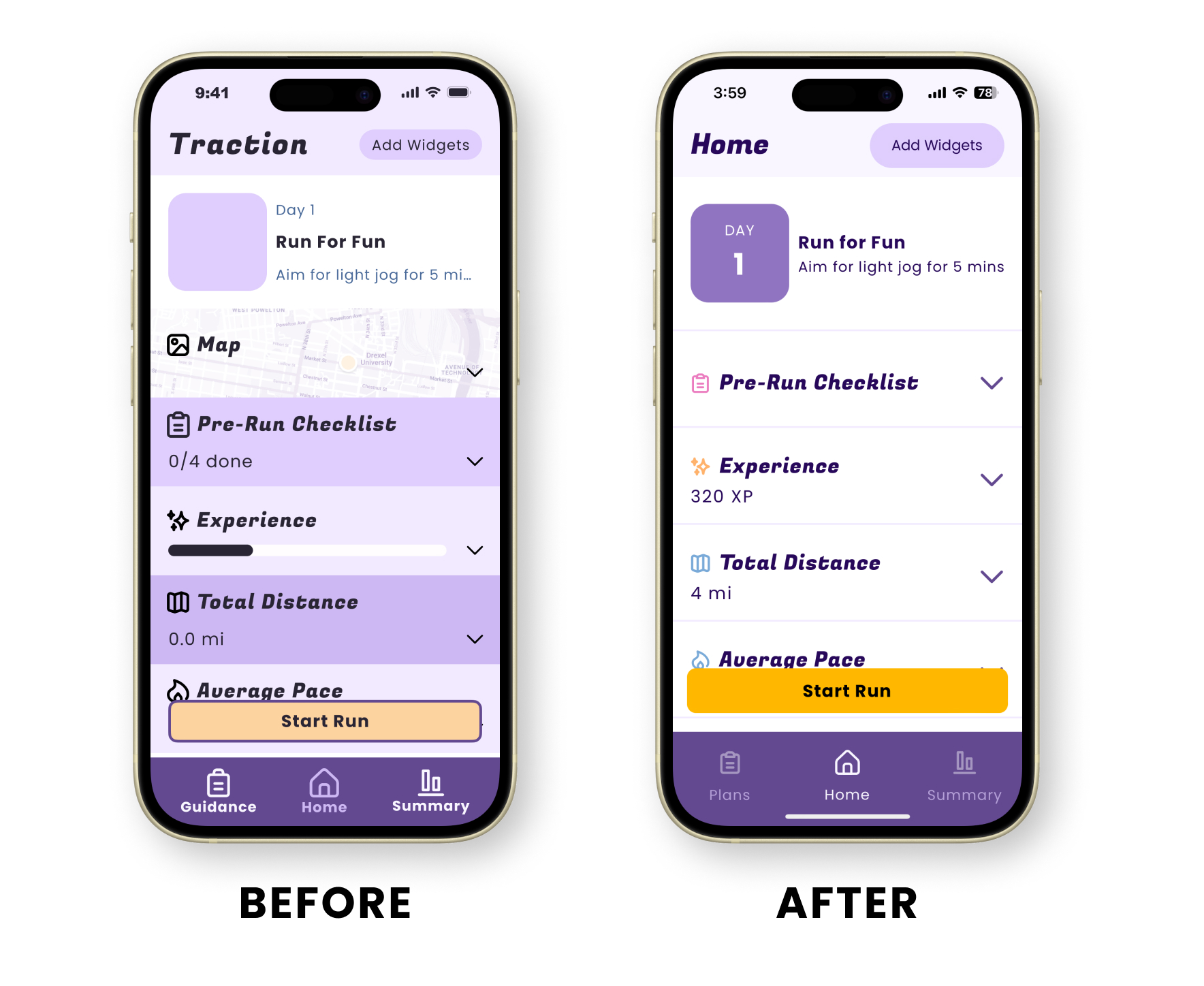
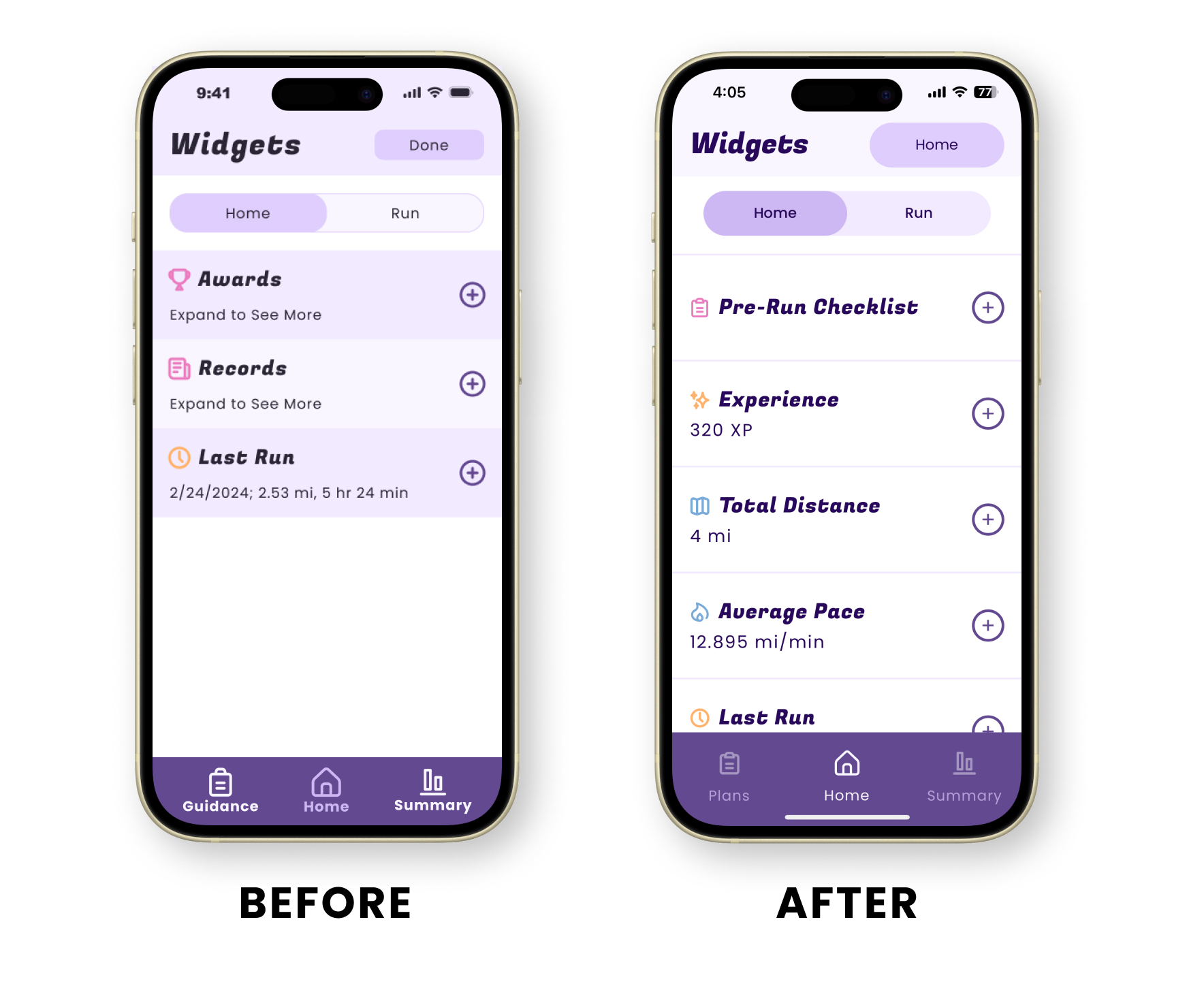
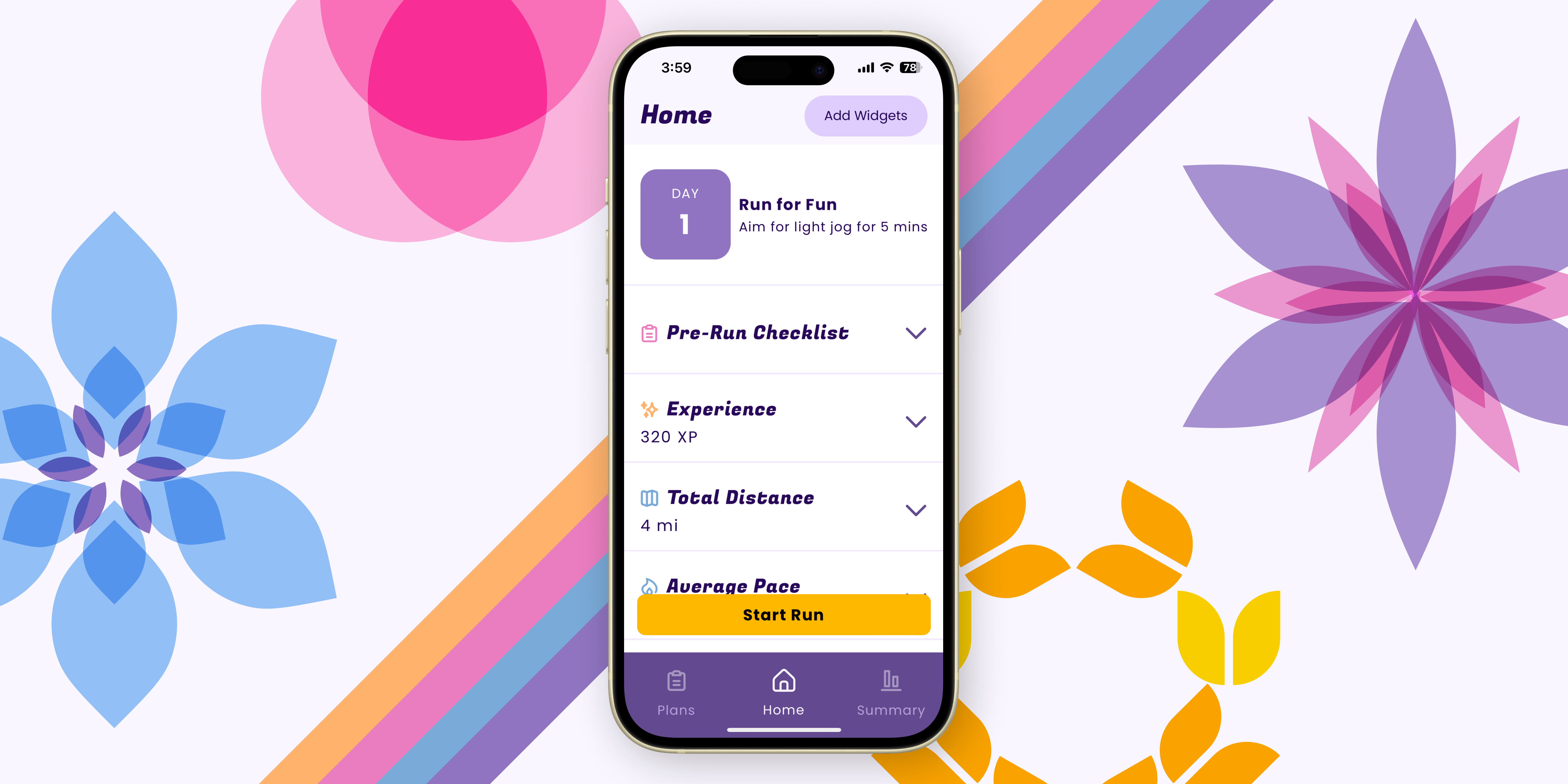
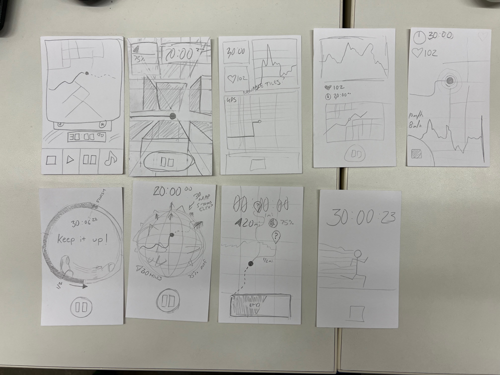
I drew up wireframe ideations for the app’s running screen, including one that is customizable with widgets.
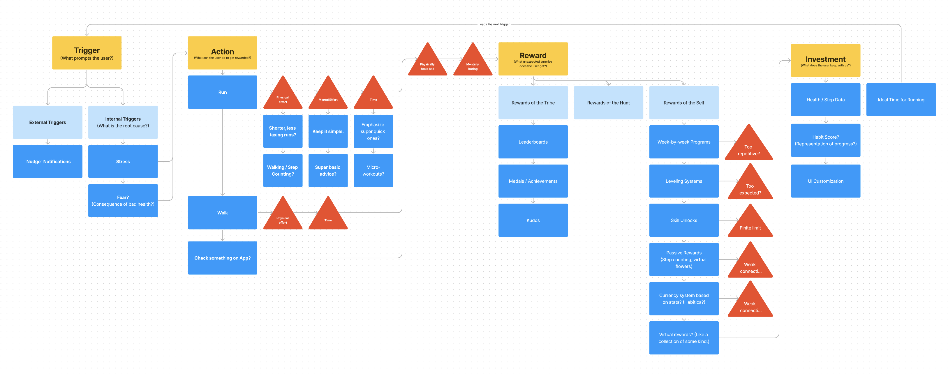
I also developed a model for getting users invested in the experience, focusing on their motivations, goals, and pain points.
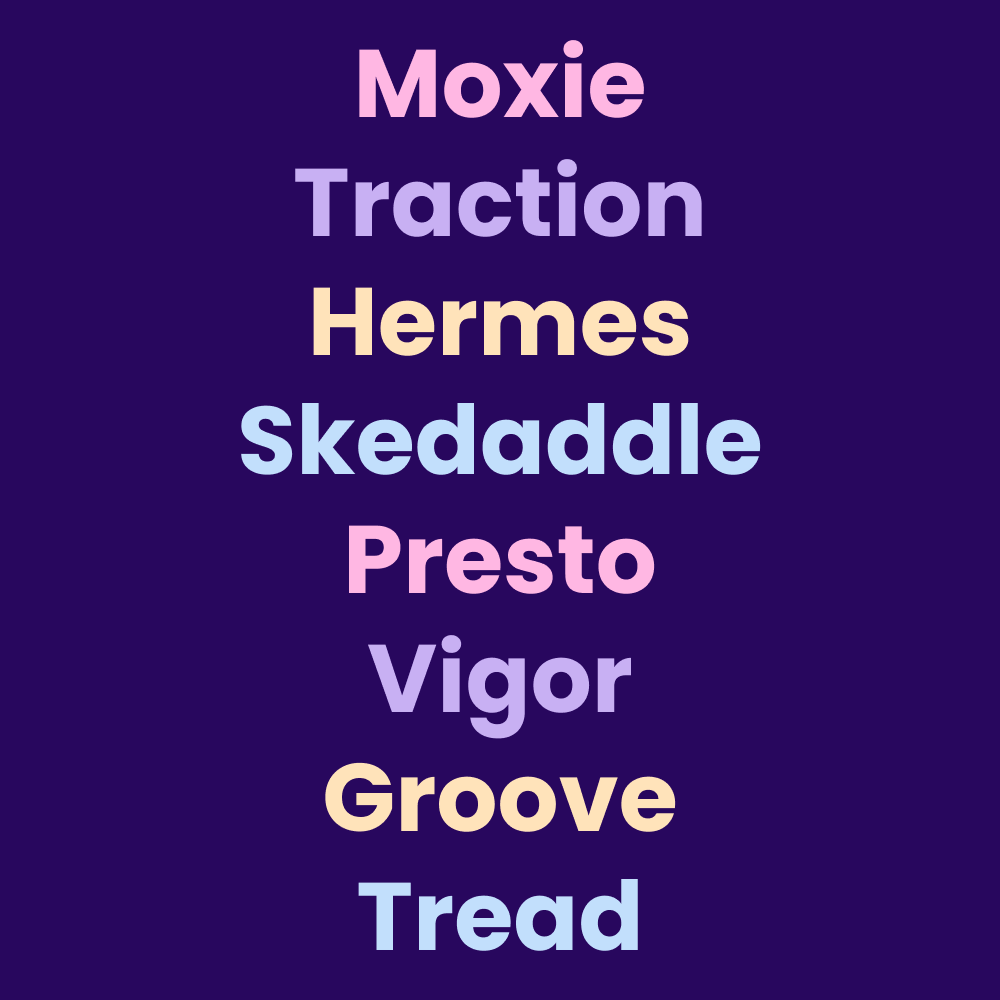
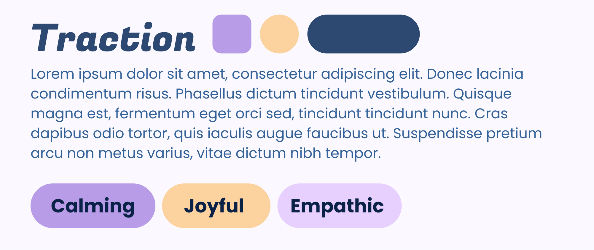
Based on our user research, I worked with the content lead to design a brand for the app. We produced a few names for the project, but ultimately landed on Traction.
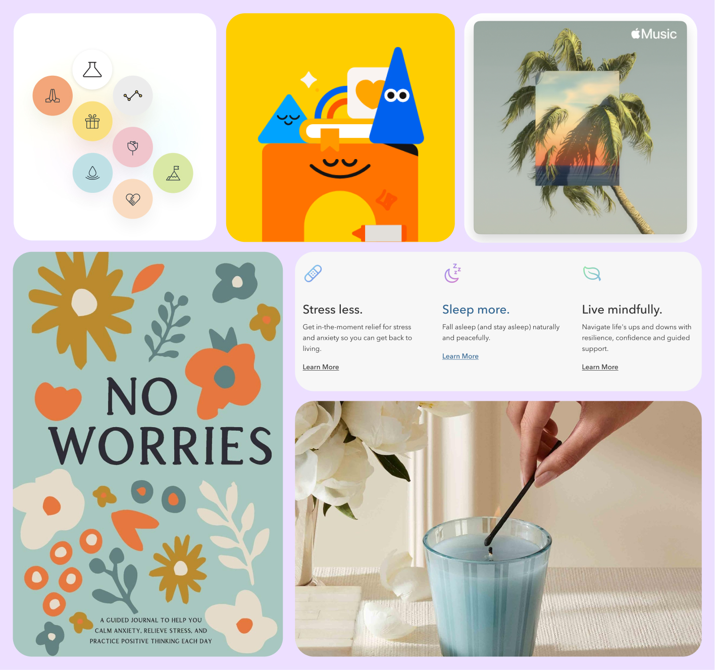
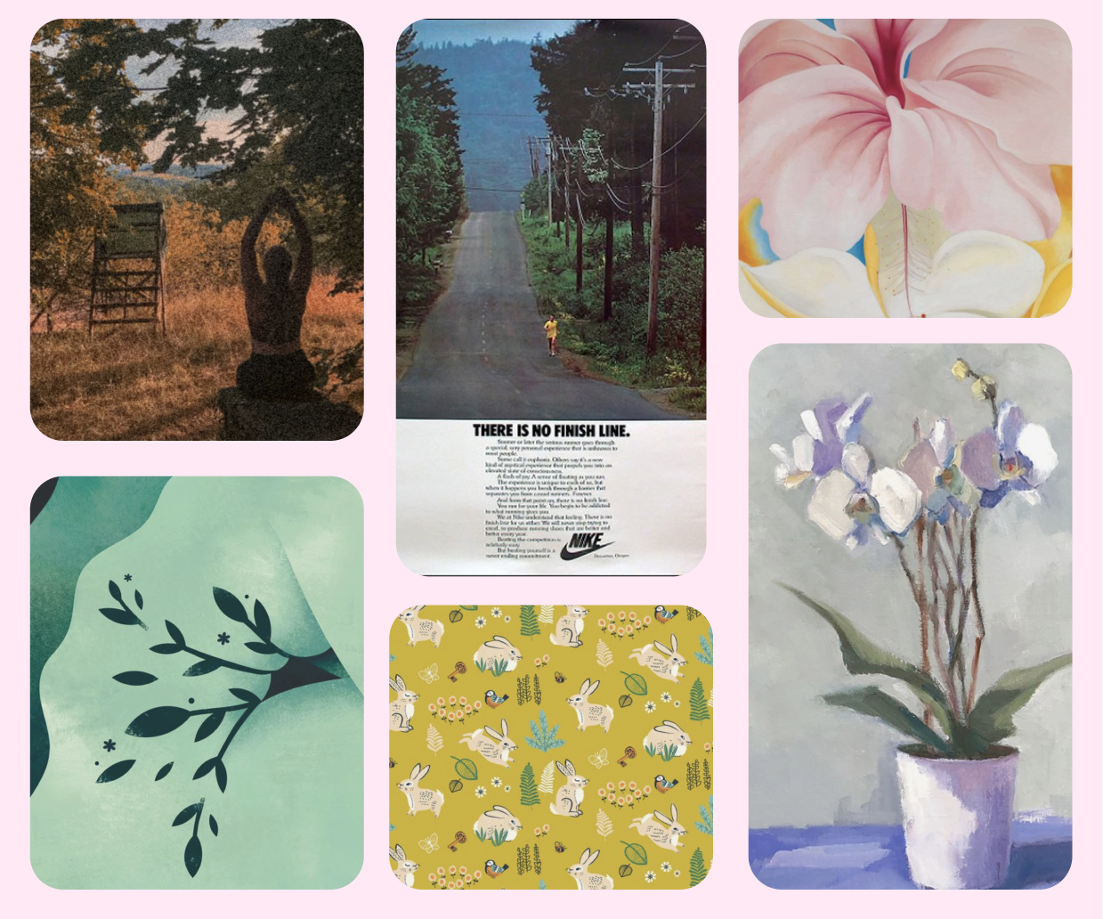
I explored other products marketed to the same demographic and created a mood board to pinpoint the vibe I was aiming for. My idea was to find an aesthetic that felt calming, joyful, and empathetic.
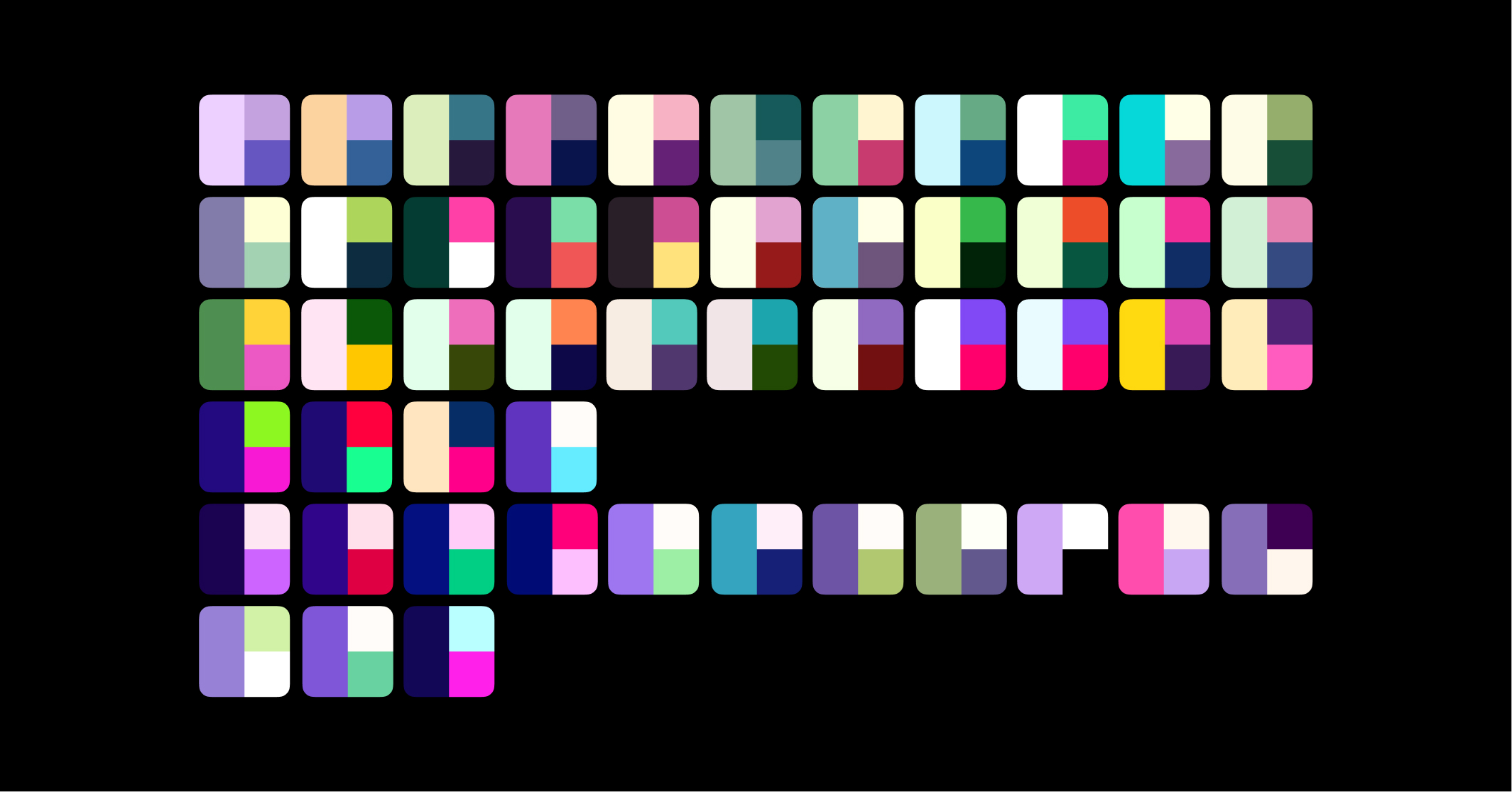
I tried out dozens of color schemes and font combinations and selected my three top choices.
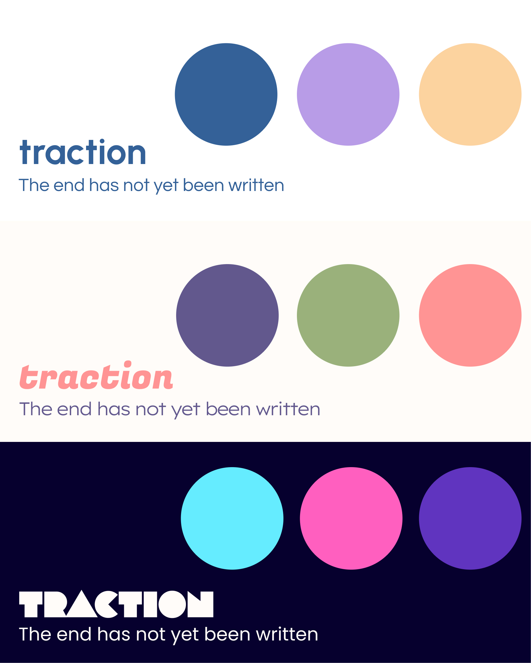
We discussed our options as a team and settled on Fugaz One and Poppins for our fonts, but further needed to explore our color scheme.
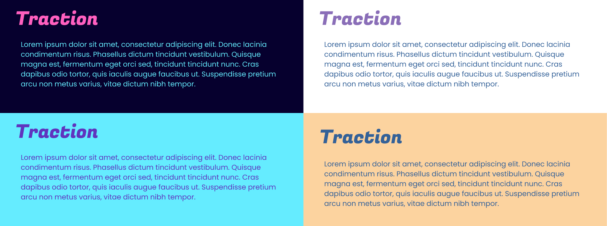
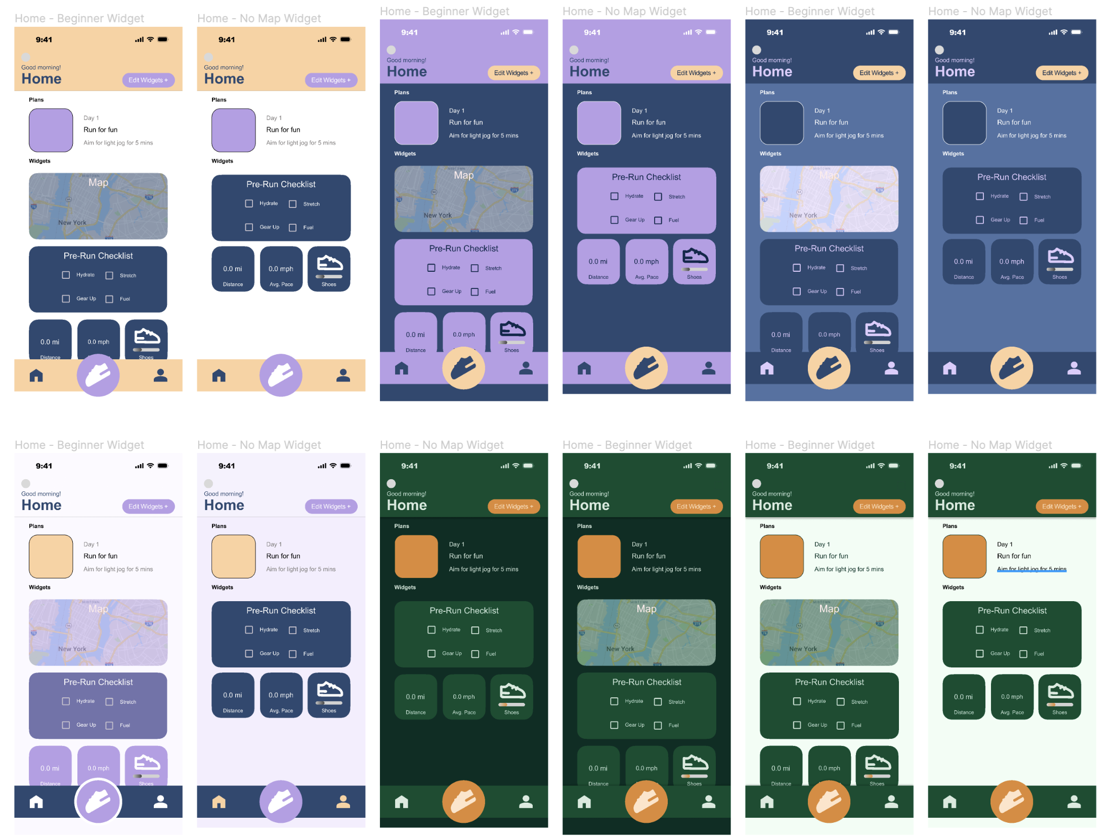
After gathering user feedback, we decided that my lavender color scheme was the one that best represented the app.
While the design team incorporated the new colors, I started building our web-app demo in Svelte. I worked with the UI designer to see which elements of the interface were considered close-to-final, and then broke those down into individual components.
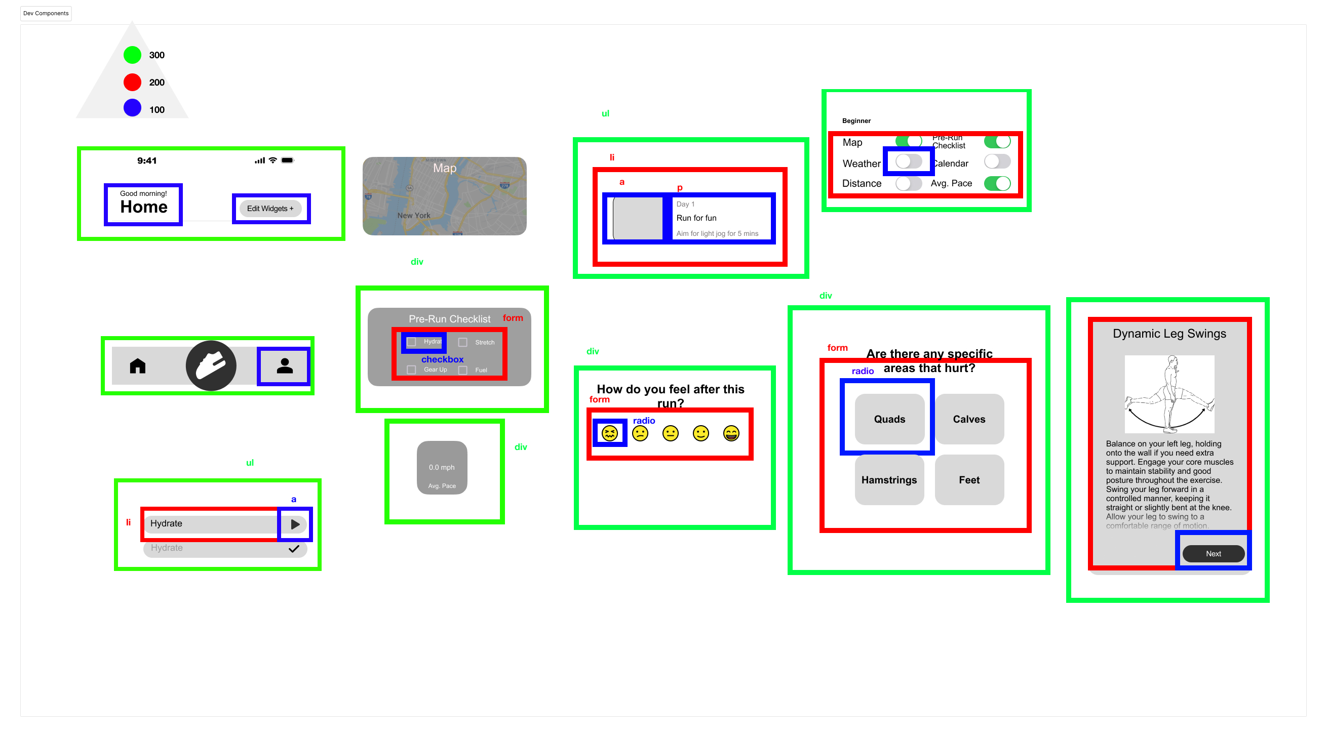
I spent the next couple of months building out the app while also cooperating with the UI designer to update the build based on user feedback.
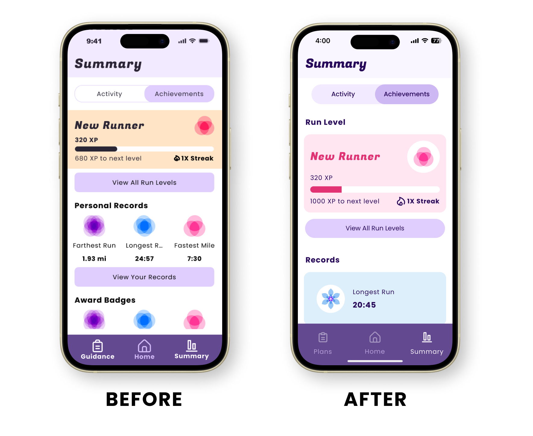
Meanwhile, I helped the UX designer create a reward system for the app. My original concept was to make it a “flower garden,” where users could slowly grow “flowers” by completing various tasks like meeting a daily step count or running a mile. Once grown, users can arrange them around on screen to personalize their collection.
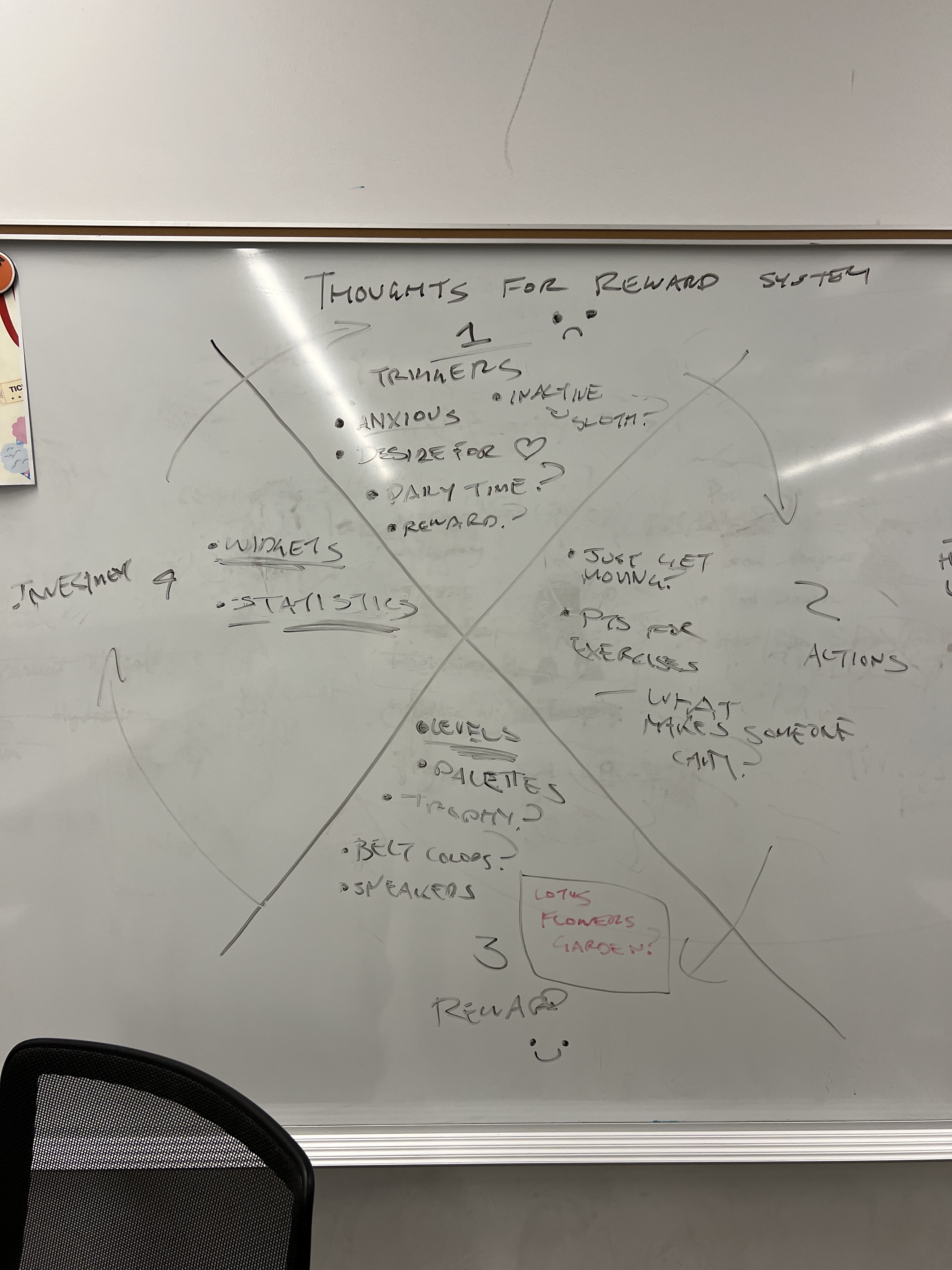
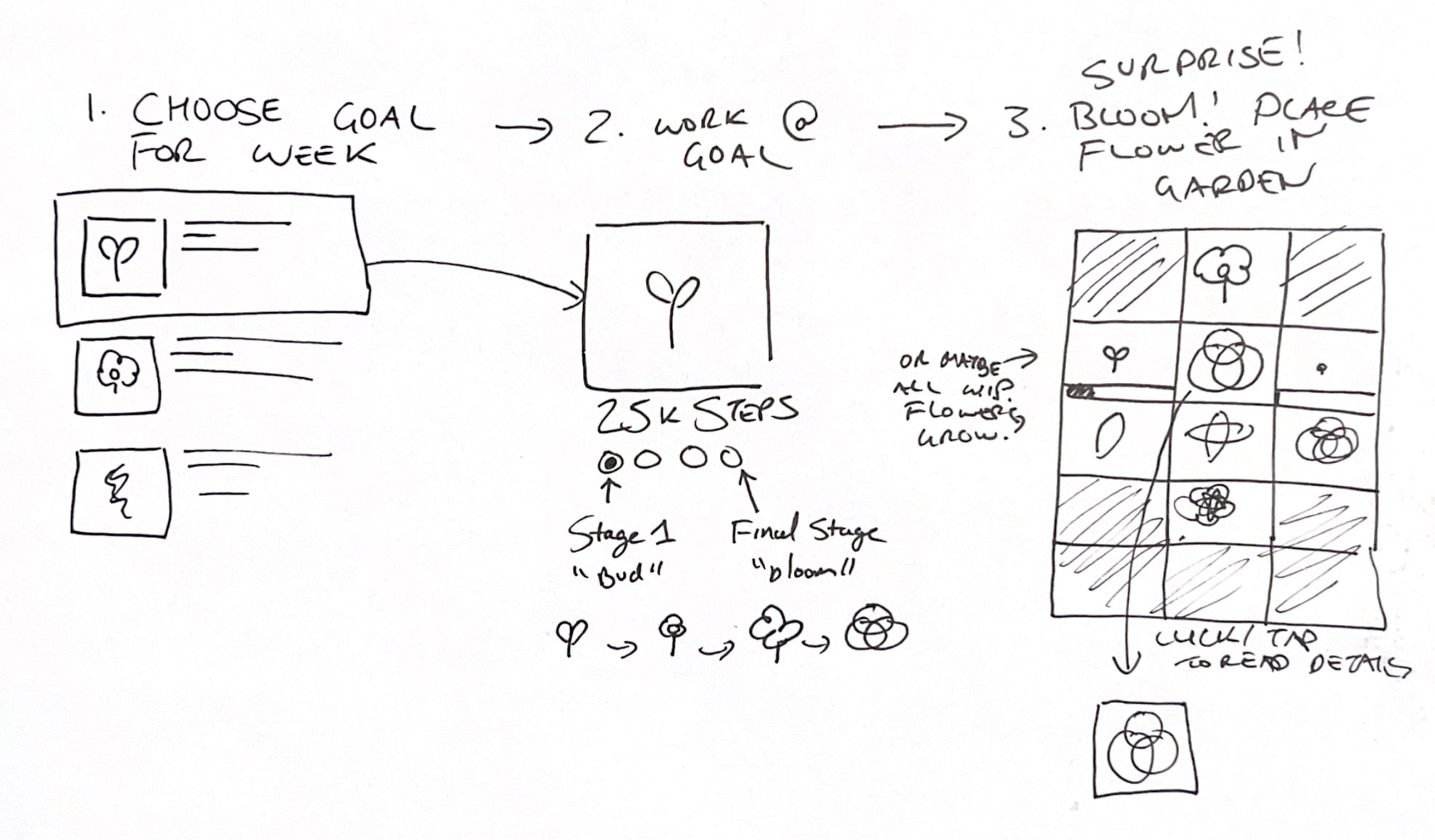
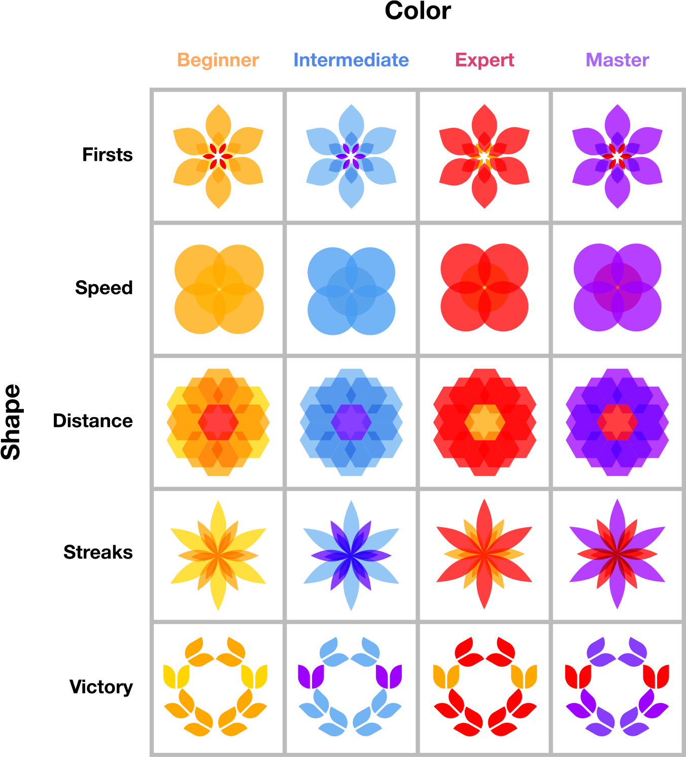
Unfortunately, the UX designer decided to scrap this idea in favor of a standard reward system that was themed around flowers.
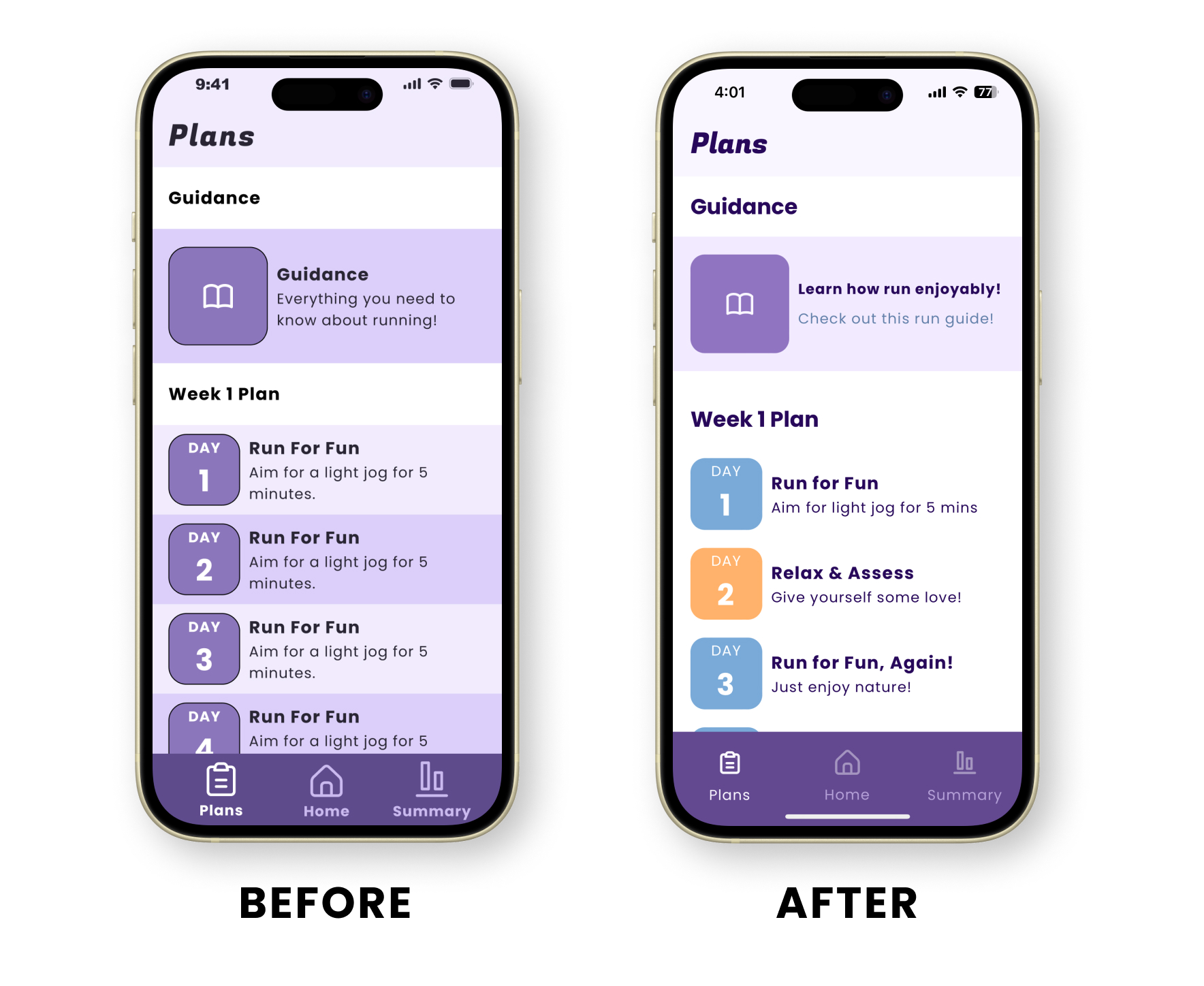
Near the end of the project, I helped the UI designer clean up the app. I toned down the accent color a bit and added smaller details to make it feel more professional.