Food Truck UX
For my first UX project, I collaborated with a team of students on designing a high-fidelity prototype for a food truck ordering app. Through this experience I learned the fundamentals of UX research while also building my teamworking skills.
Context & Challenges
The prototype we built was our final project for a course we took on User Experience Design. The goal was to work together to create an ordering experience for one of the food trucks that visits University City. We had about ten weeks to create a prototype for this hypothetical app.
Process & Insights
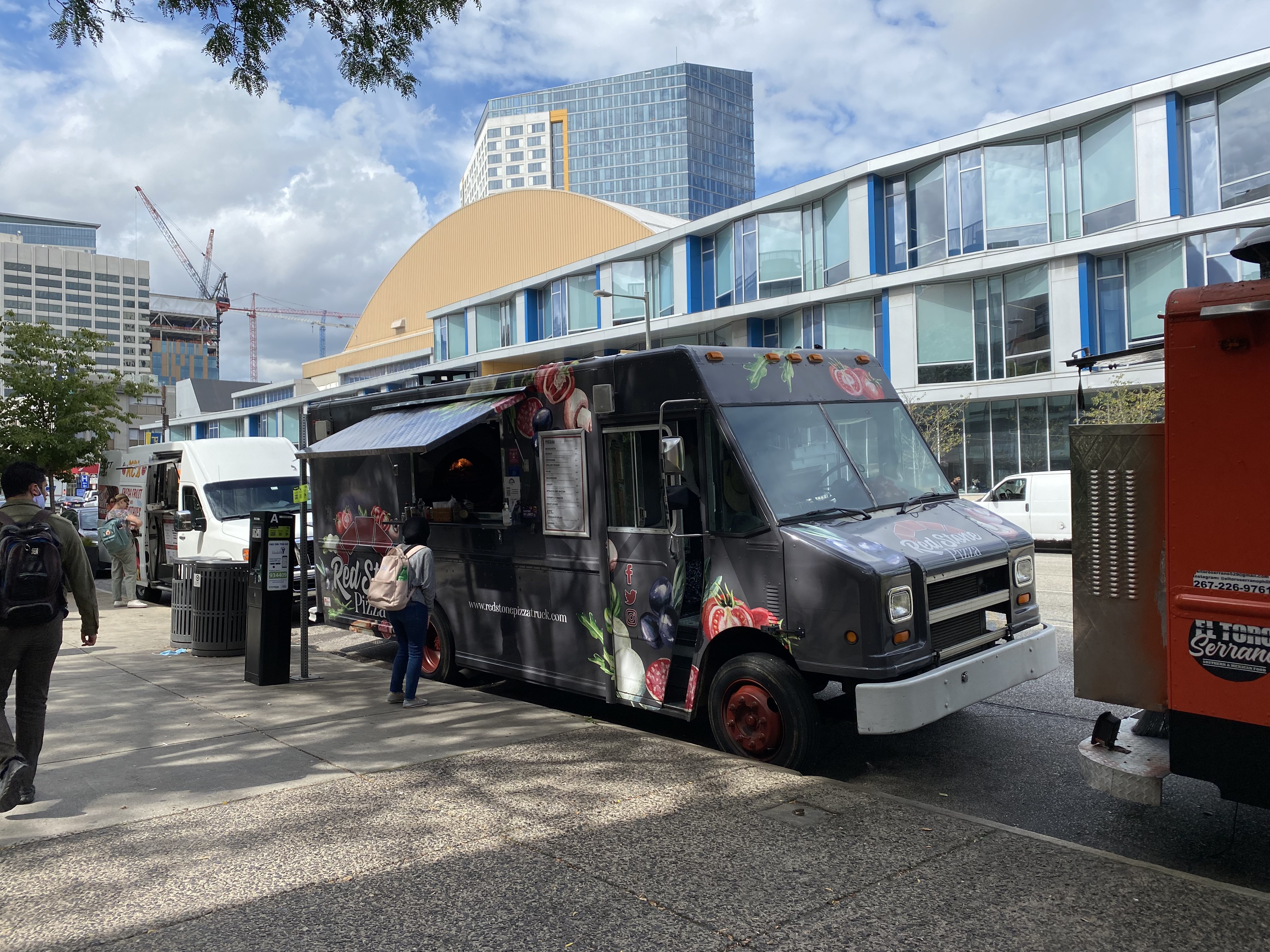
We started the project by scouting out food trucks in the area and discovering Redstone Pizza – a food truck that specializes in making brick-oven pizzas. We chose this because of its strong brand identity and reasonably sized menu.
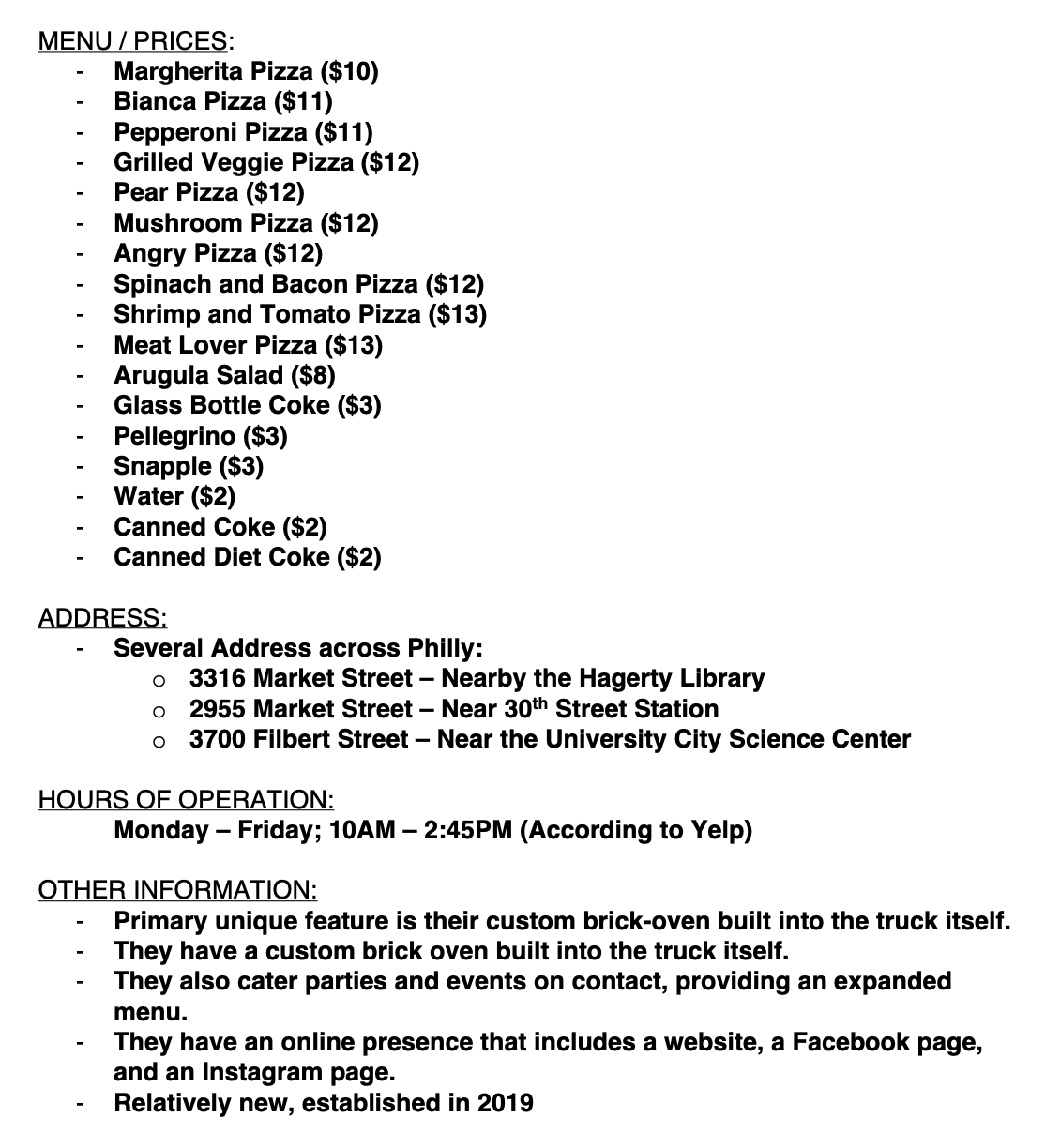
Once we decided on our truck, I compiled data on the specifics of the business to get a better sense of the operations.
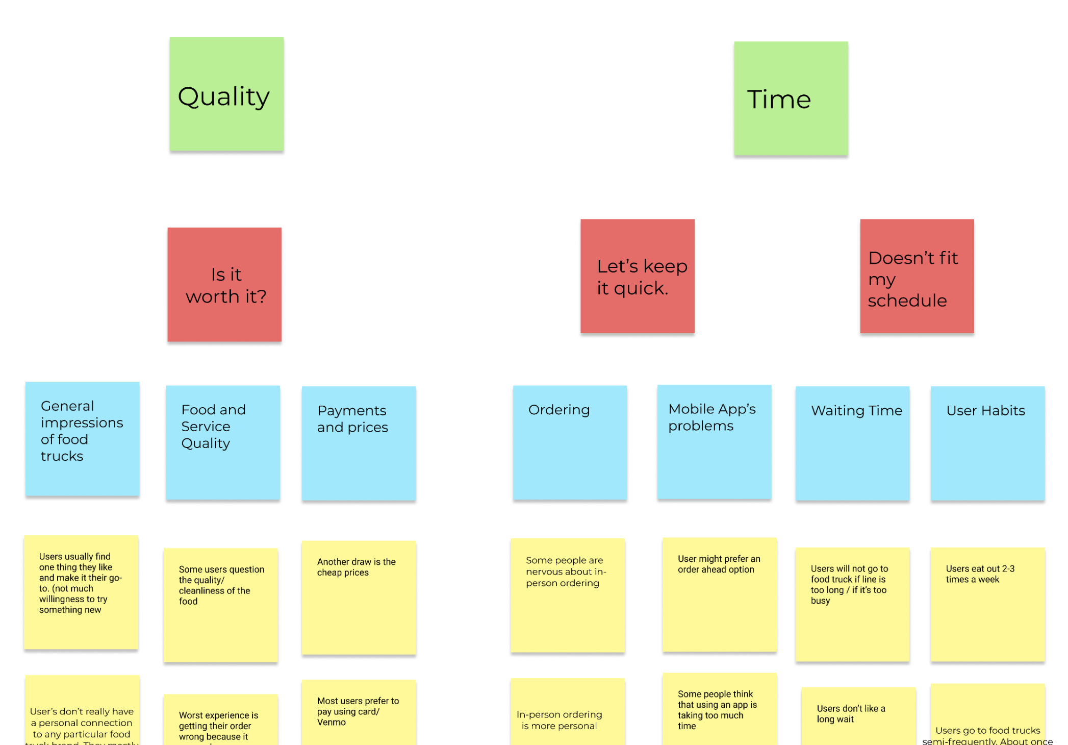
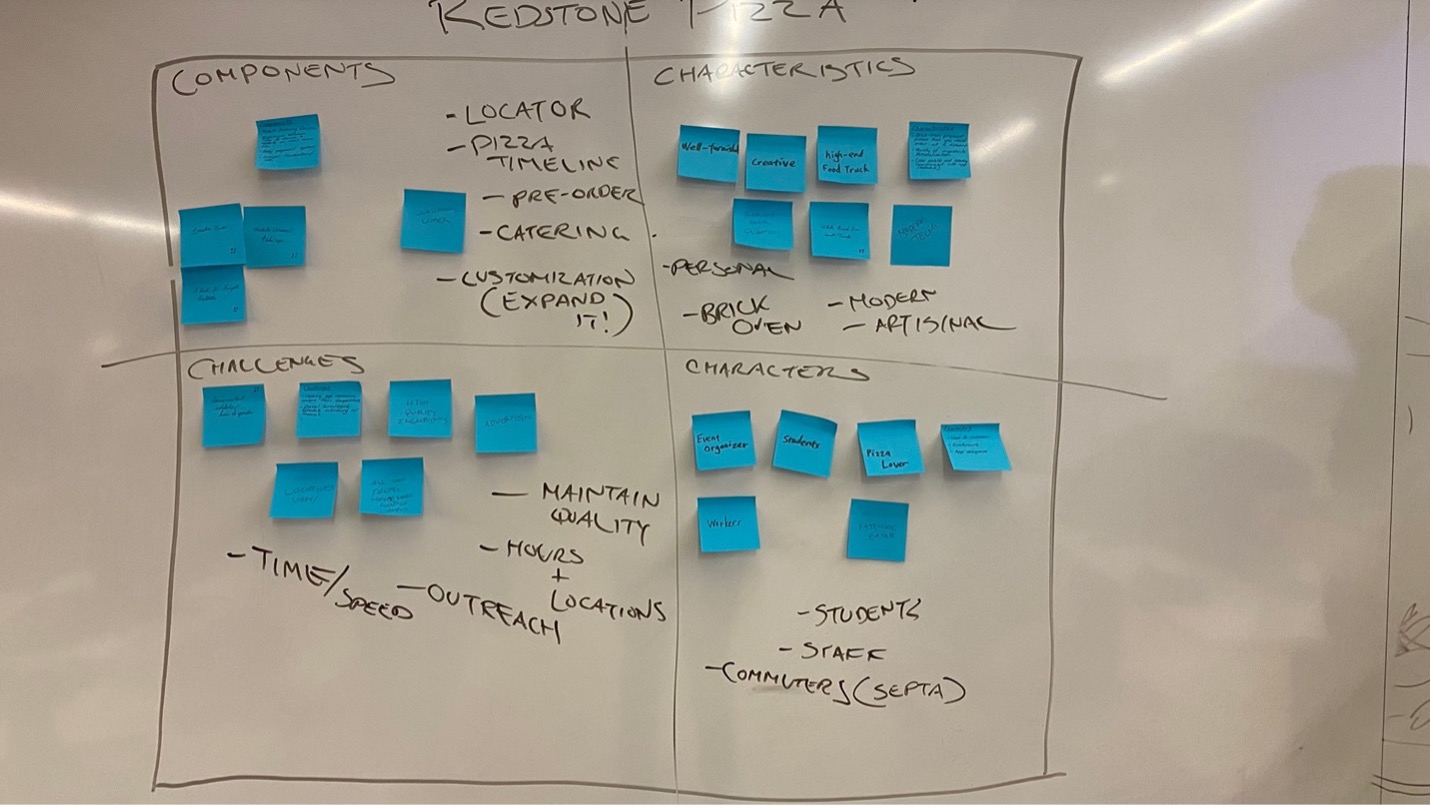
We used this information - alongside other observations made by the team - to run through a few ideation exercises. We discovered that the most important aspects to consider for our design solution were to ensure that the experience was fast, accurately locates the truck, and looks trustworthy.
I developed a proto-persona based on the “commuter” archetype we identified in our research to help compile the results.
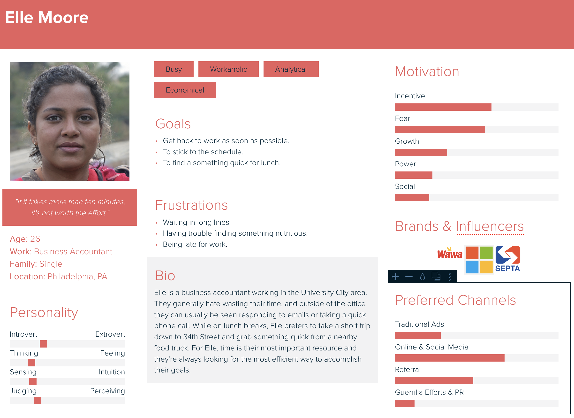
This persona helped inform my decision to focus on creating concepts that would speed up the ordering process, while also making it more engaging. For instance: one of the main concepts I produced during this phase was to have the user “build” a virtual representation of the pizza throughout the app, and then slide it into an oven to confirm the order.
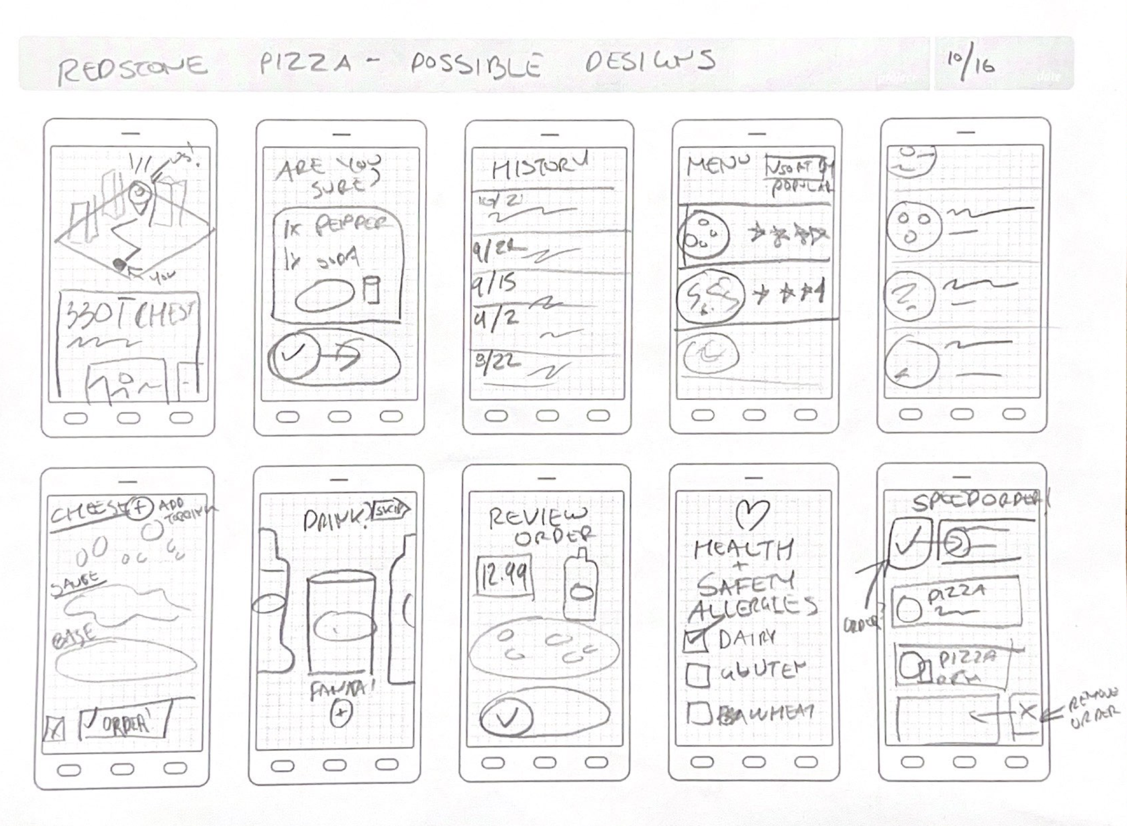
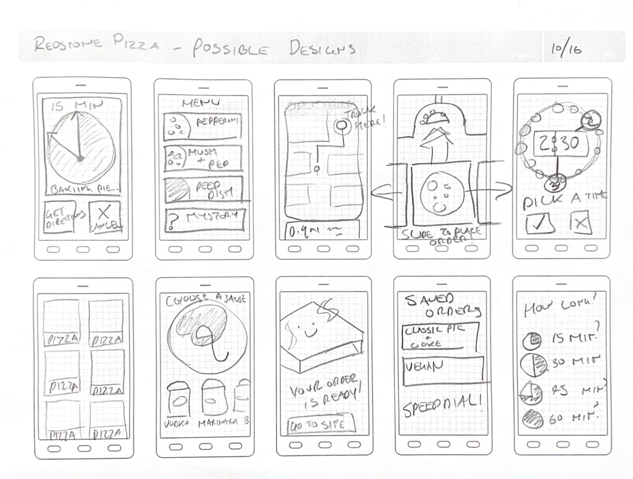
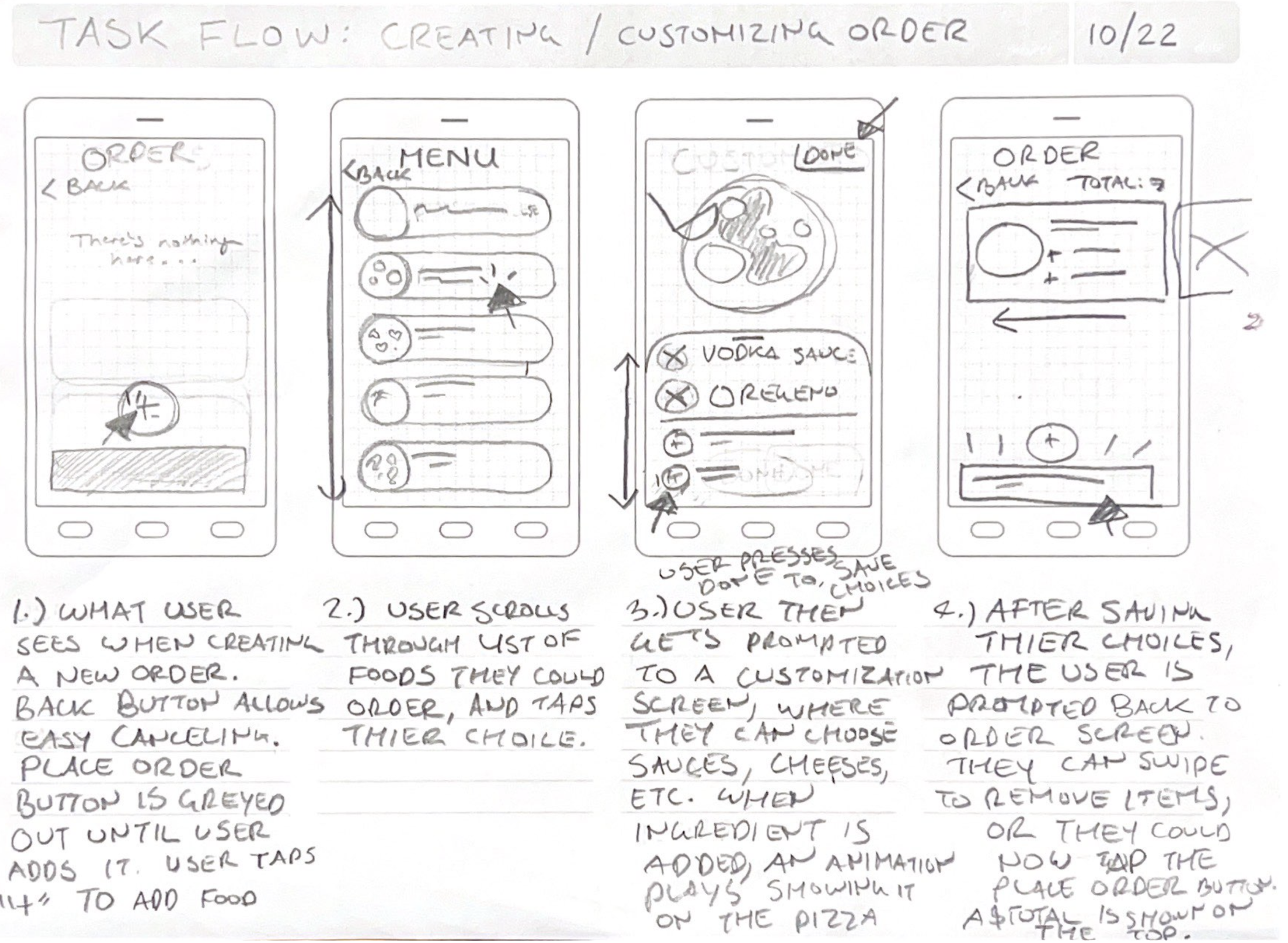
These - alongside other sketches made by the team - were iterated to produce a paper prototype that we tested with users.
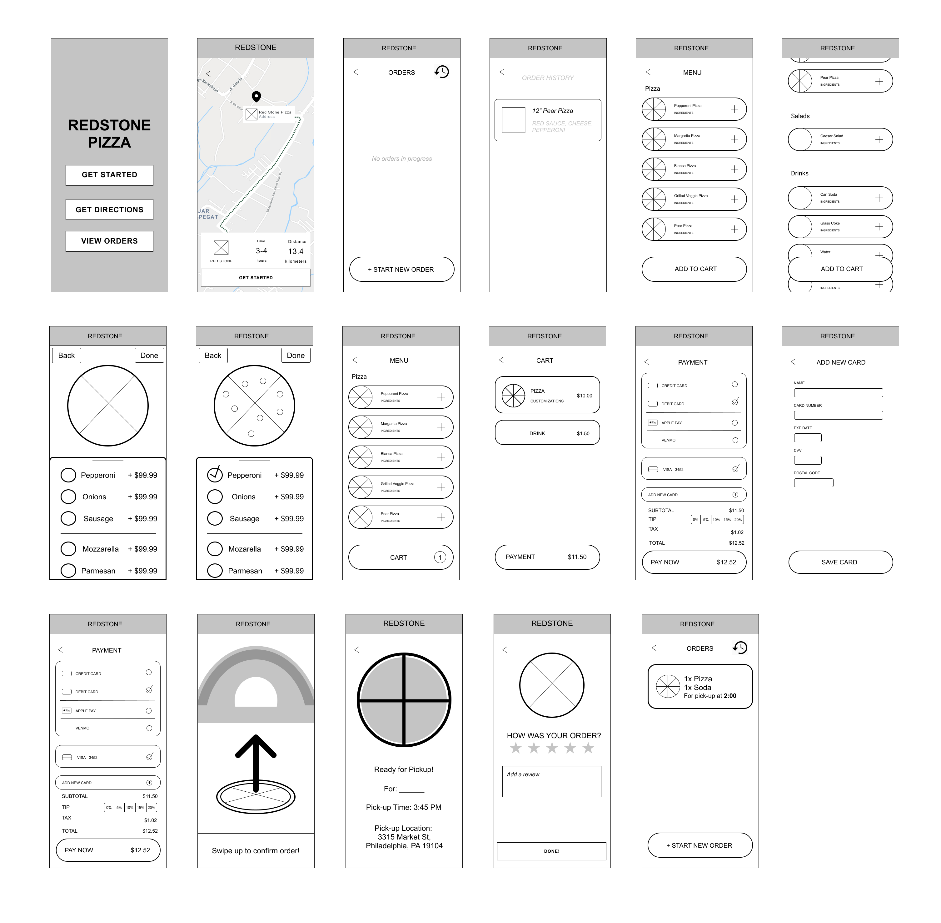
The result was unsuccessful. Our tests found critical problems with the solution – namely the lack of control over order customization. This led to a revision where we tried to balance control with speed.
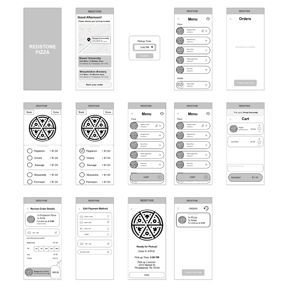
This prototype was better received but it still had some issues. We found that our users liked having some more control over the ordering process, however the experience felt cluttered and confusing. We aimed to clean up the design a bit in our next attempt.
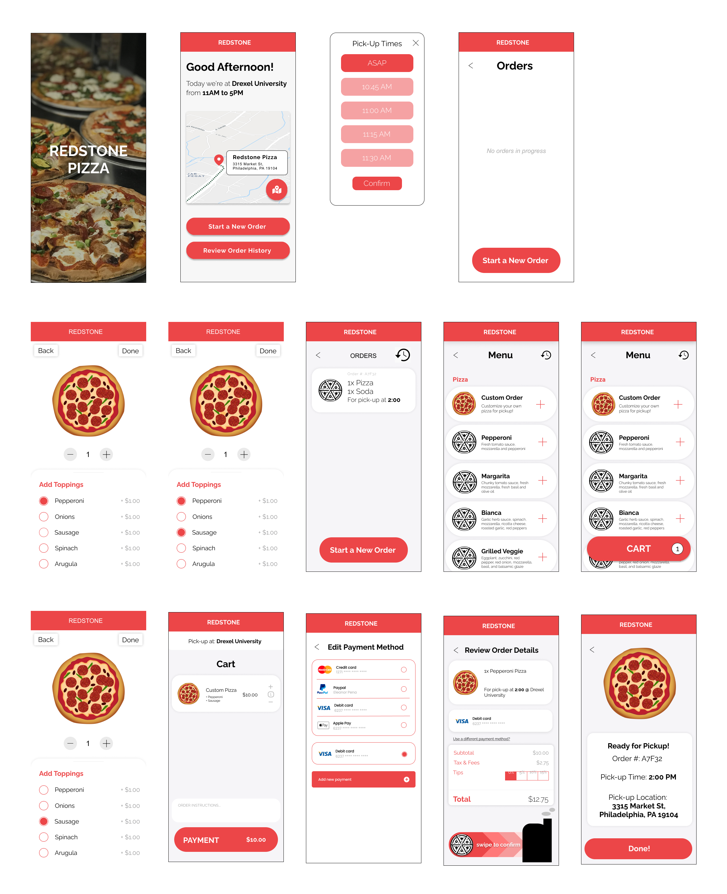
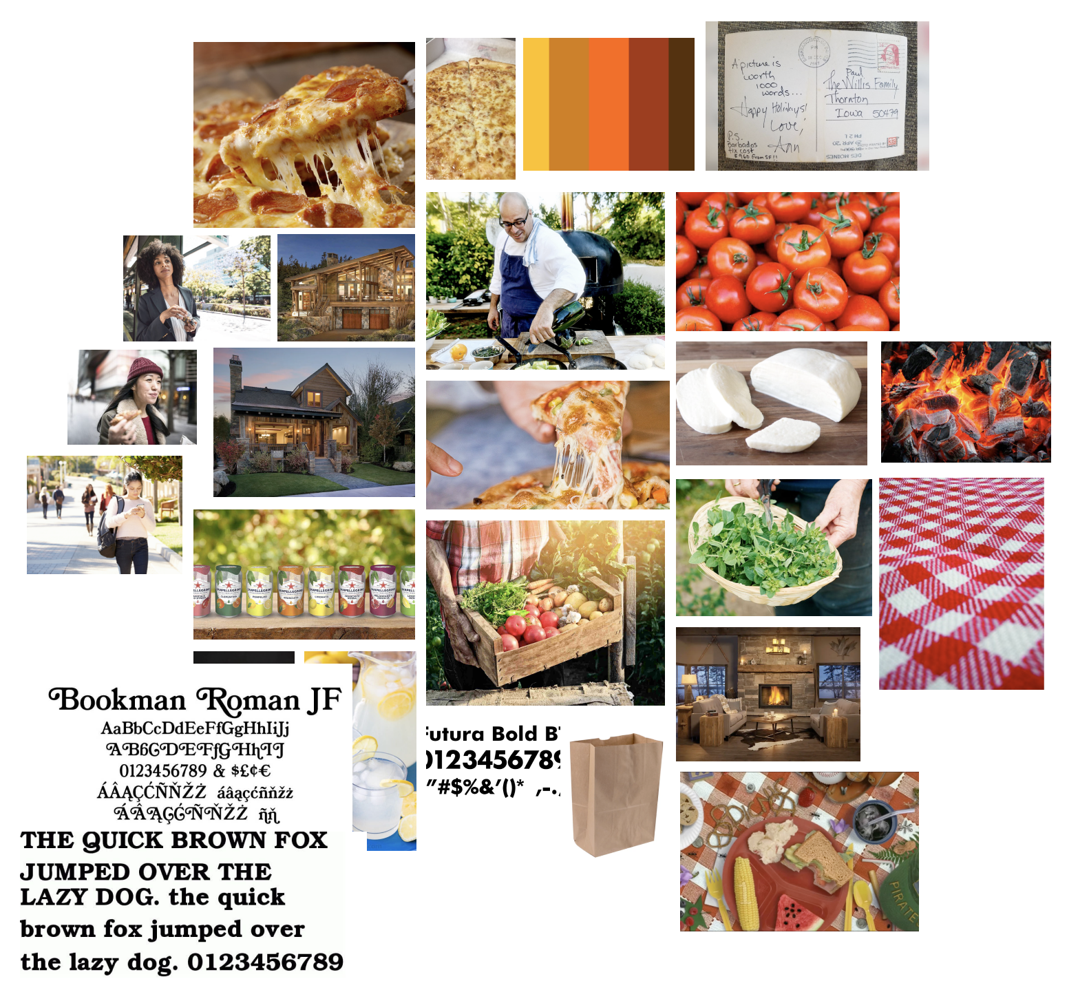
This tested well with users, but they were looking for a stronger brand identity. I made a mood board to create a sense of the vibe we were looking for.
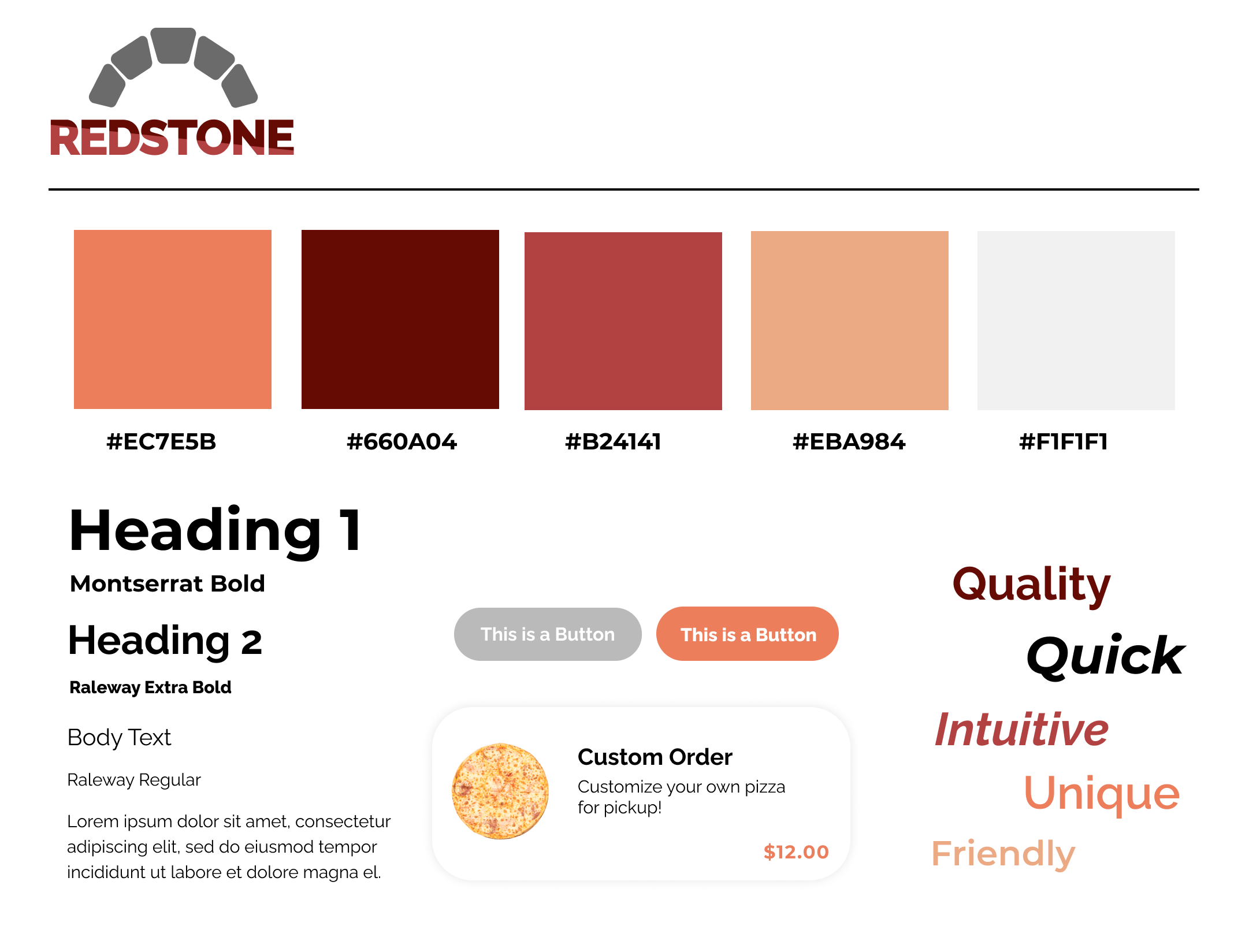
We created a style guide for our prototype based on this board – hoping to make it a little more fun but struggling to find a way to keep it professional.
Solution
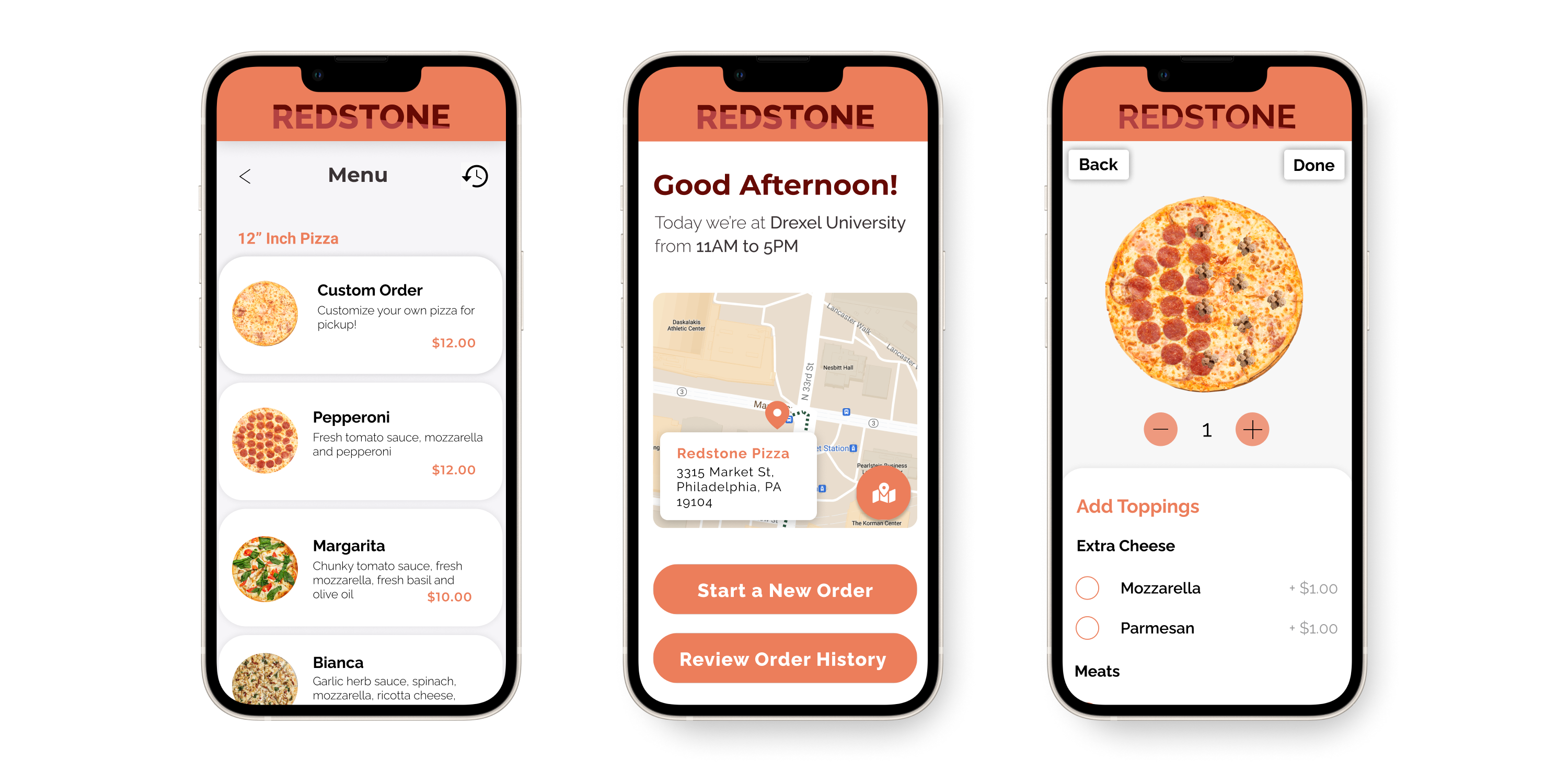
Finally, we implemented these styles into a high-fidelity prototype. Although there are many things that I would have done differently today, I feel that, for a first UX project, the research was solid and it was fun to learn the basics alongside my fellow team members.
