Ratio
Ratio is a web-app I designed to help people make choices. What started out as a fun winter break activity became a UI design project that tested my ability to create a simple, satisfying, and useful tool for people.
Context & Challenges
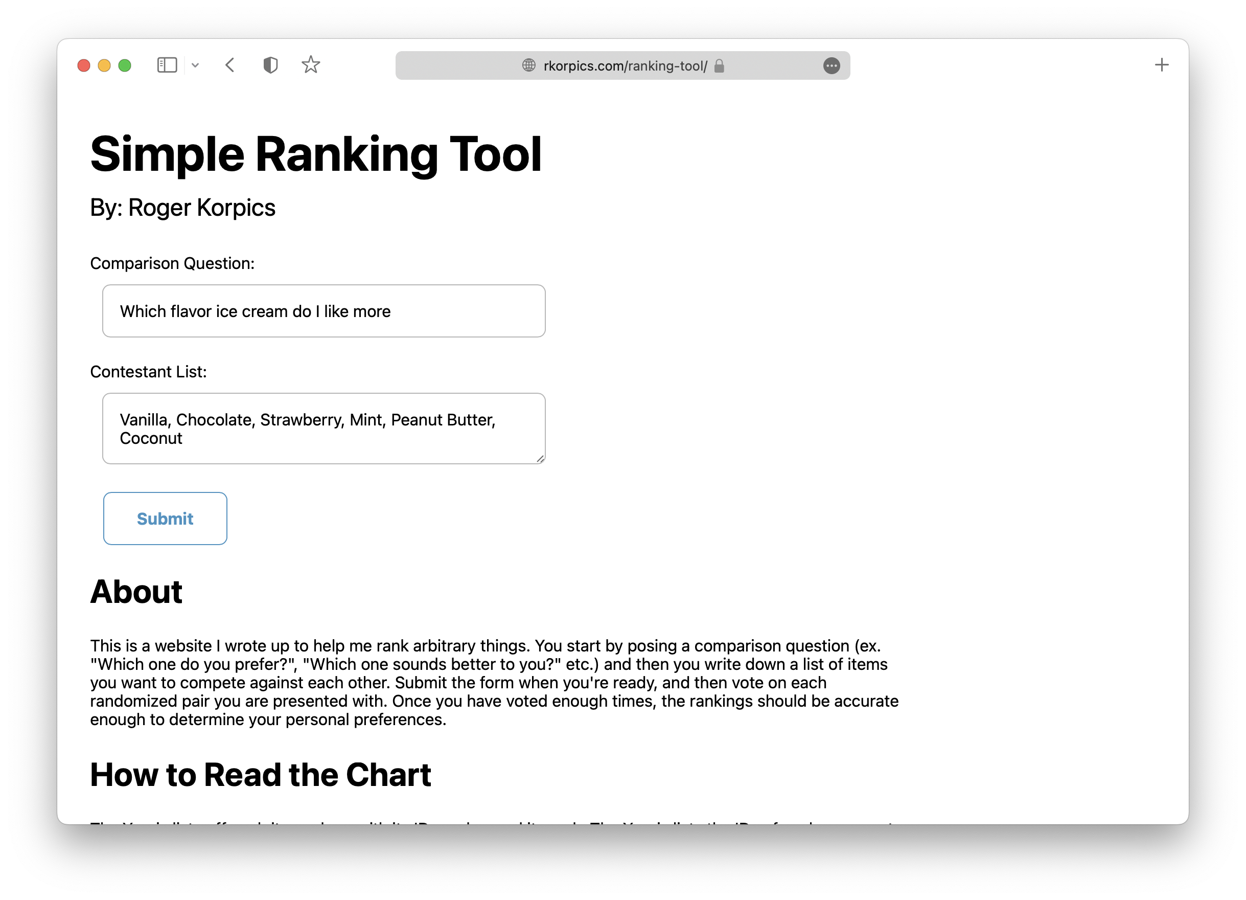
The idea for Ratio came from my desire to build adjective ladders for my creative writing projects. I was aiming to have an easy way to build charts that I could reference to get a sense of where a word lands on any arbitrary scale. Additionally, I was looking for a small project to tackle during my vacation so that I wouldn't get rusty in my web-development skills. I focused my efforts on seeing if I could get it working using front-end languages.
Process & Insights
I needed to a write an algorithm that could determine a user’s preferences based on any random list of items. I decided to write up a script that would generate a comparison ranking system based on any given array. I chose this because comparison ranking helps reduce mental load by breaking up the process into smaller decisions, while also ensuring that the user thoroughly considers all possibilities.
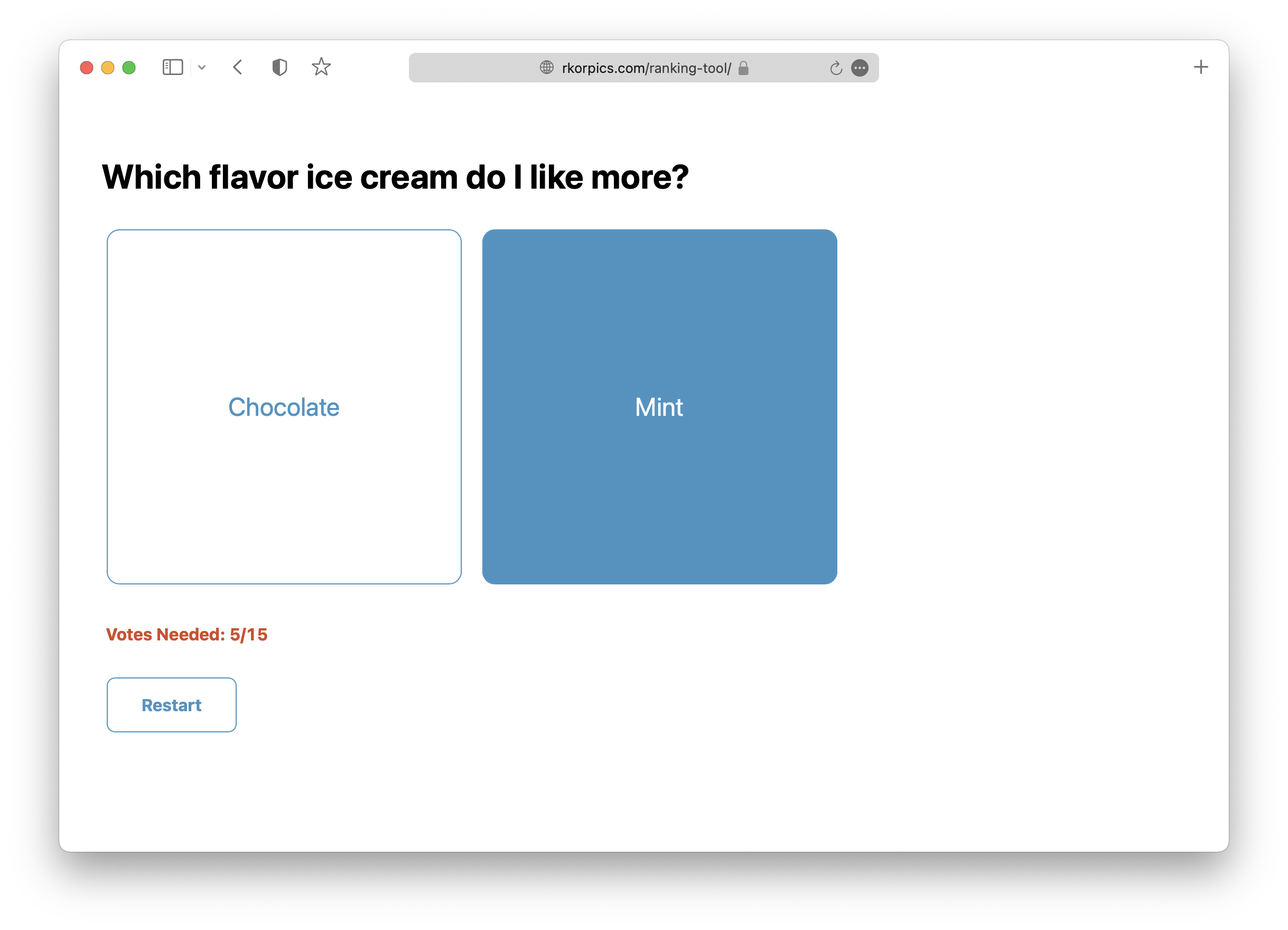
I demonstrated this prototype to a few users, who all liked the concept, but felt that the experience was clunky and took longer than expected.
To improve it, I ran a competitive analysis of comparable products in the marketplace and found that the fastest ones were often the most streamlined – providing very few features beyond the core functionality of making a choice. Additionally, most products I found were designed as simple mobile apps.
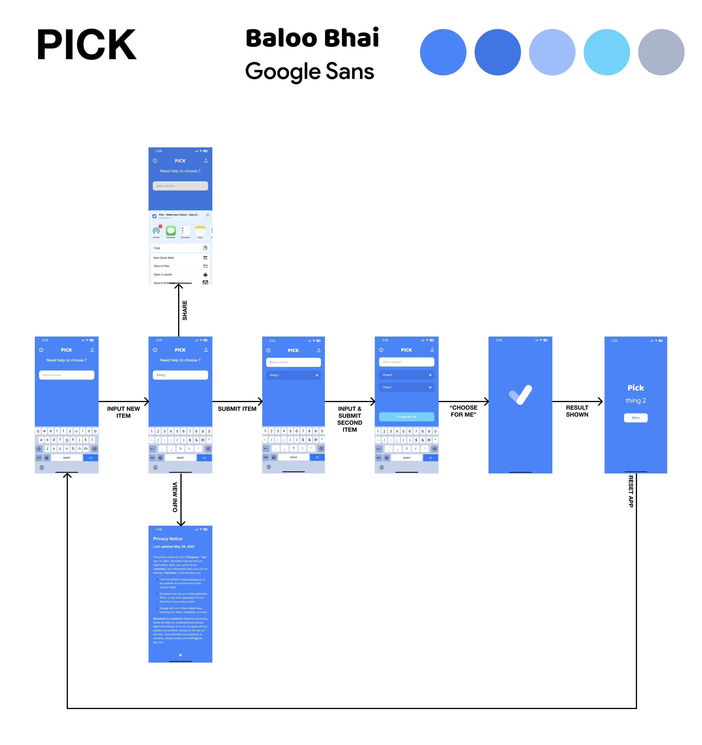
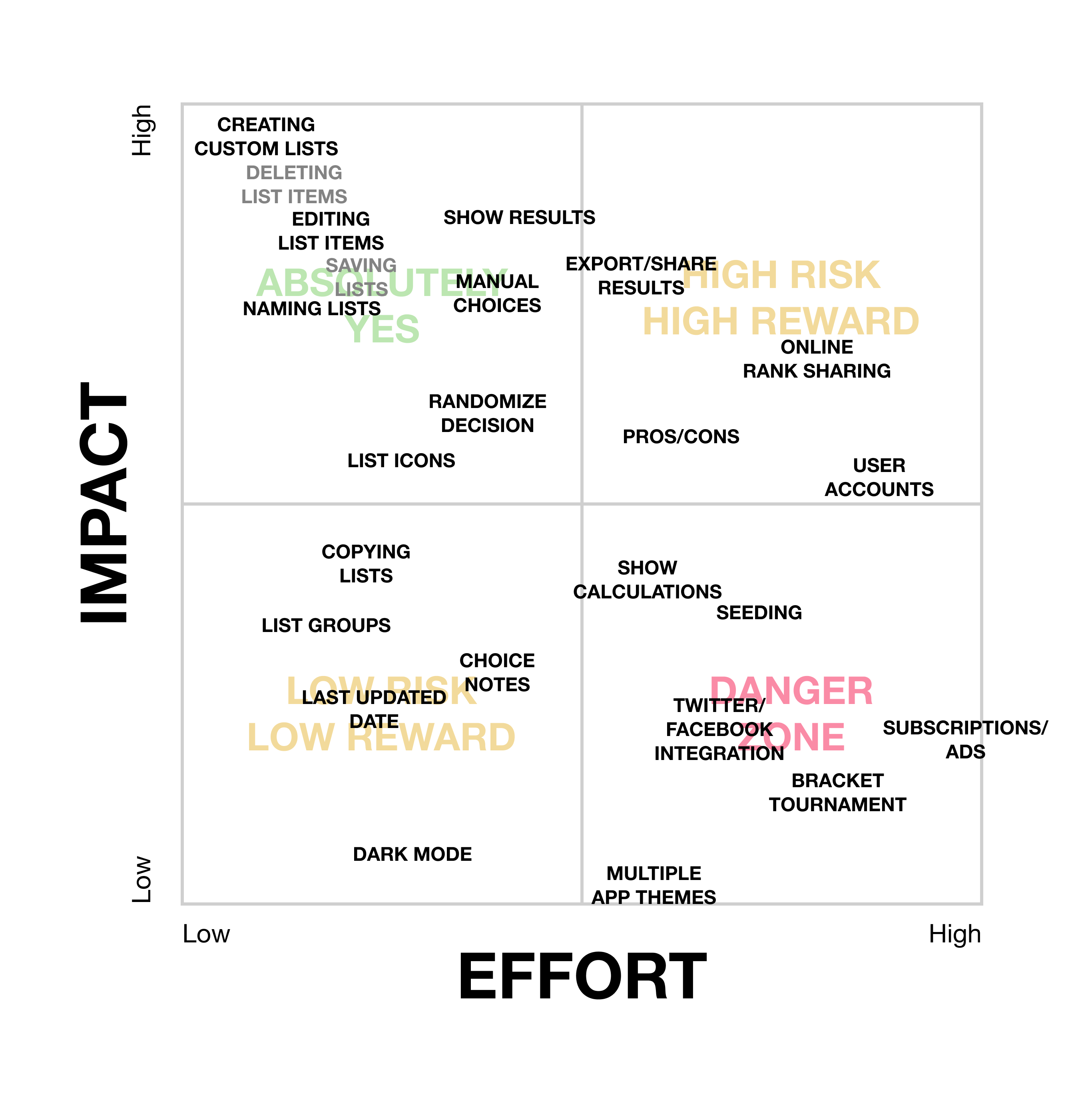
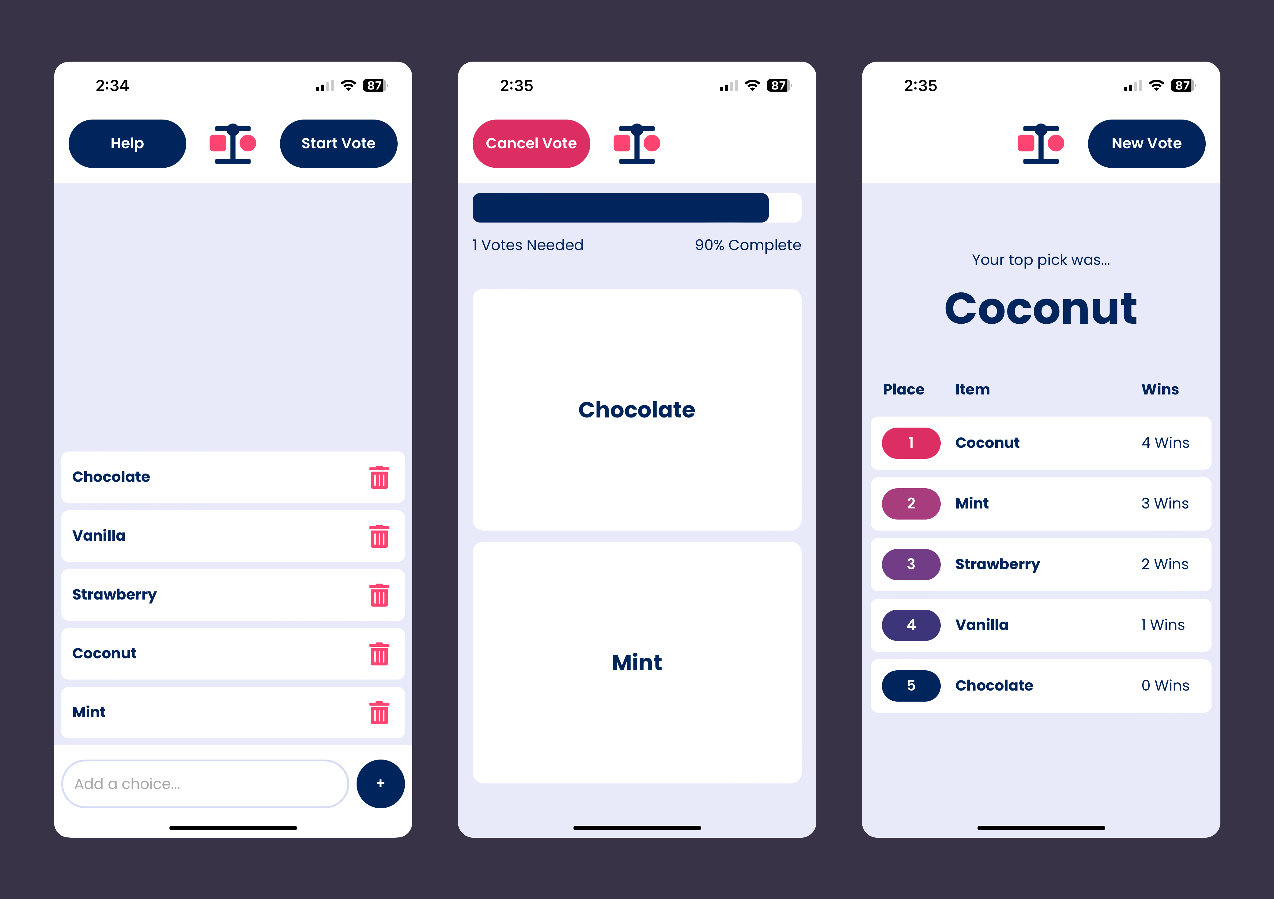
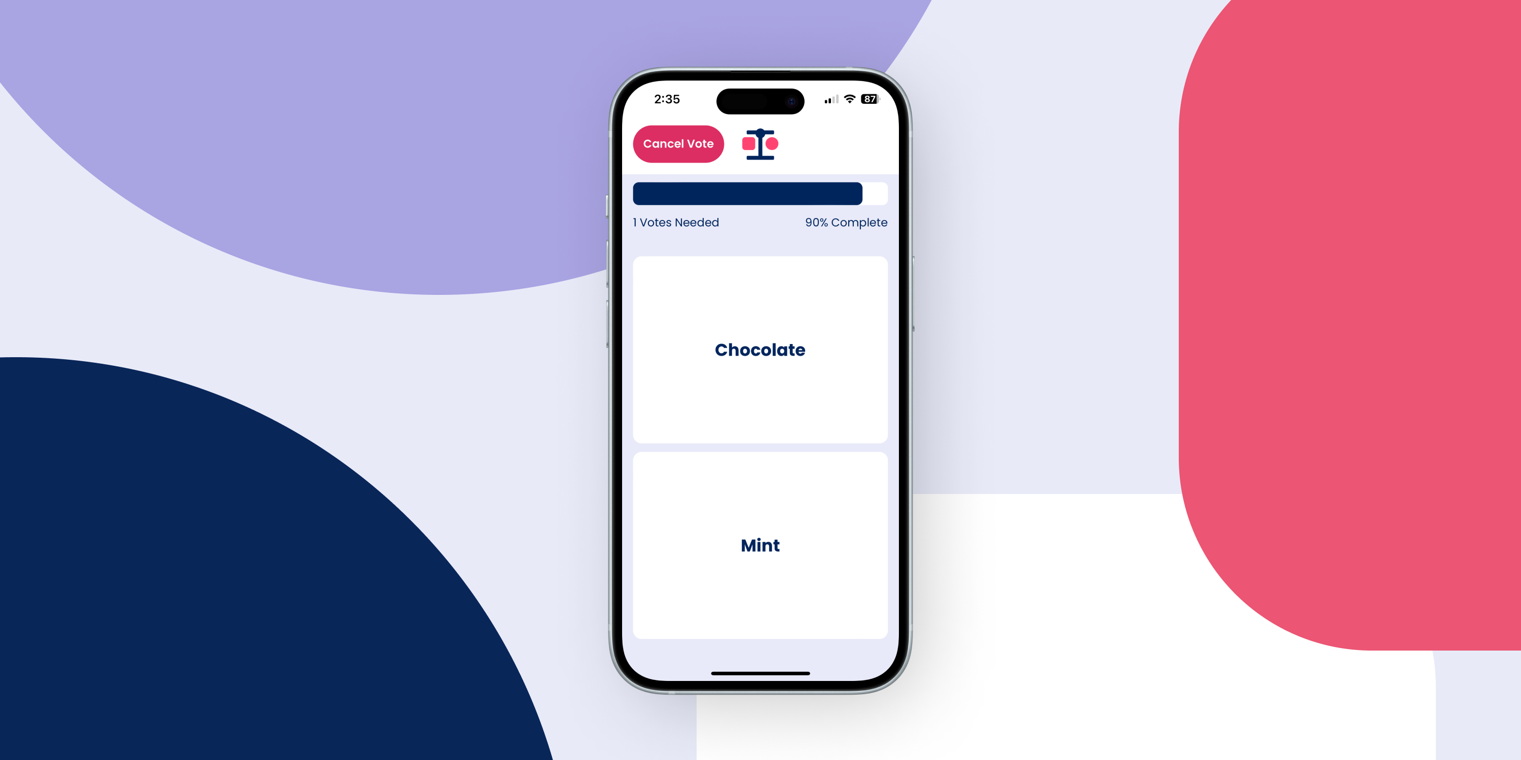
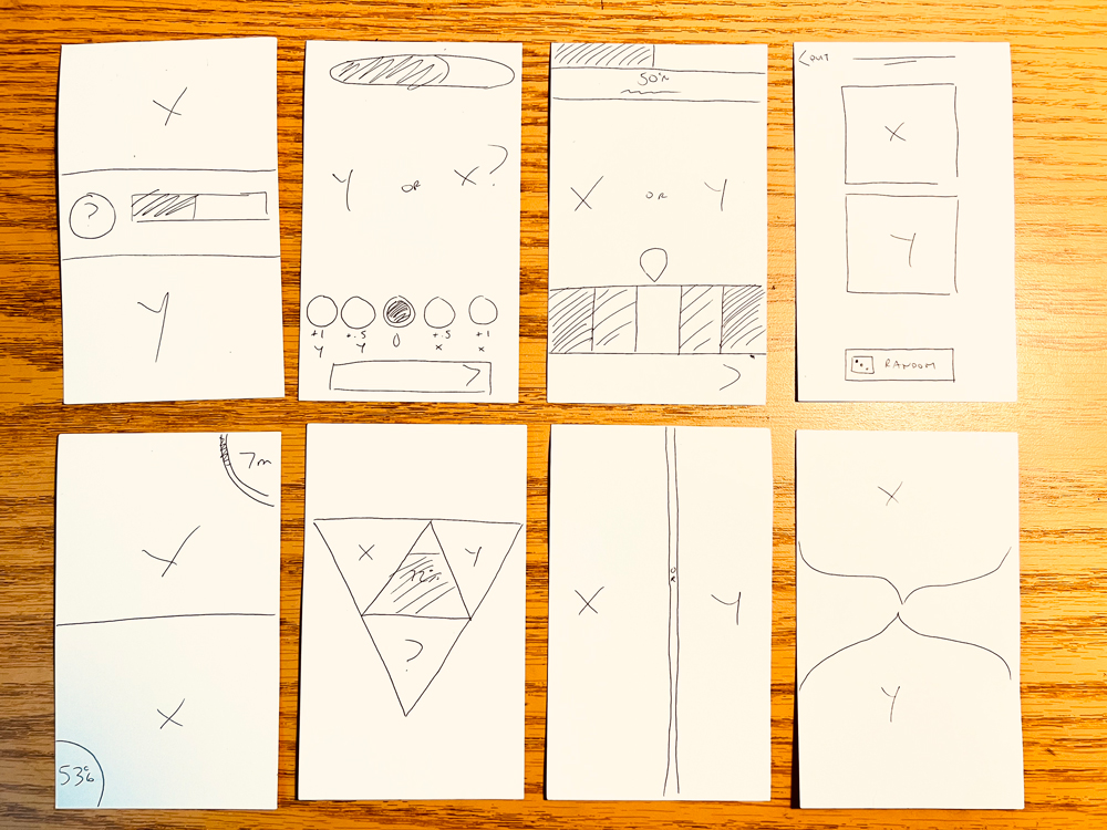
I developed a series of low-fidelity UI prototypes for a mobile version of the website. I moved the key interactions towards the bottom of the screen instead of the middle so that it would be easier to reach, and changed how list creation works so that it would be simpler to edit. I also decided to create a new results screen that organized each item from most-to-least chosen.
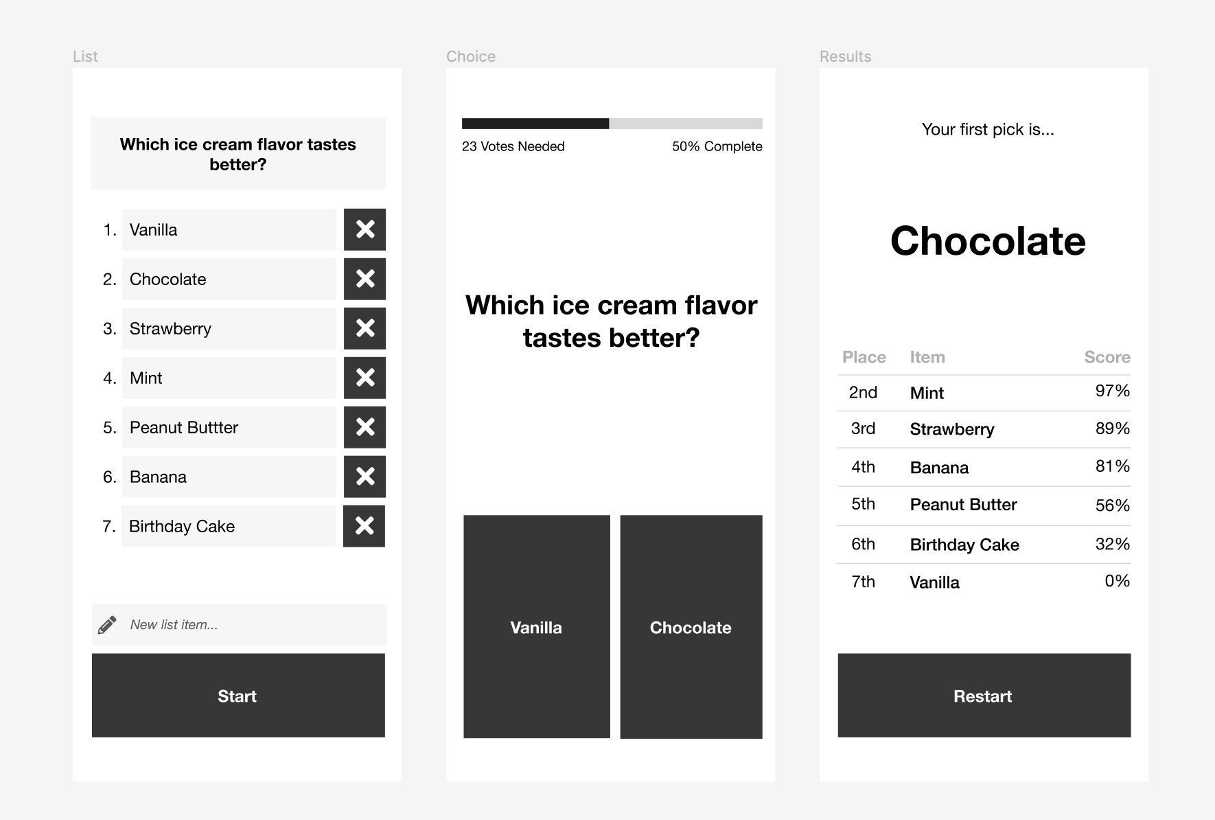
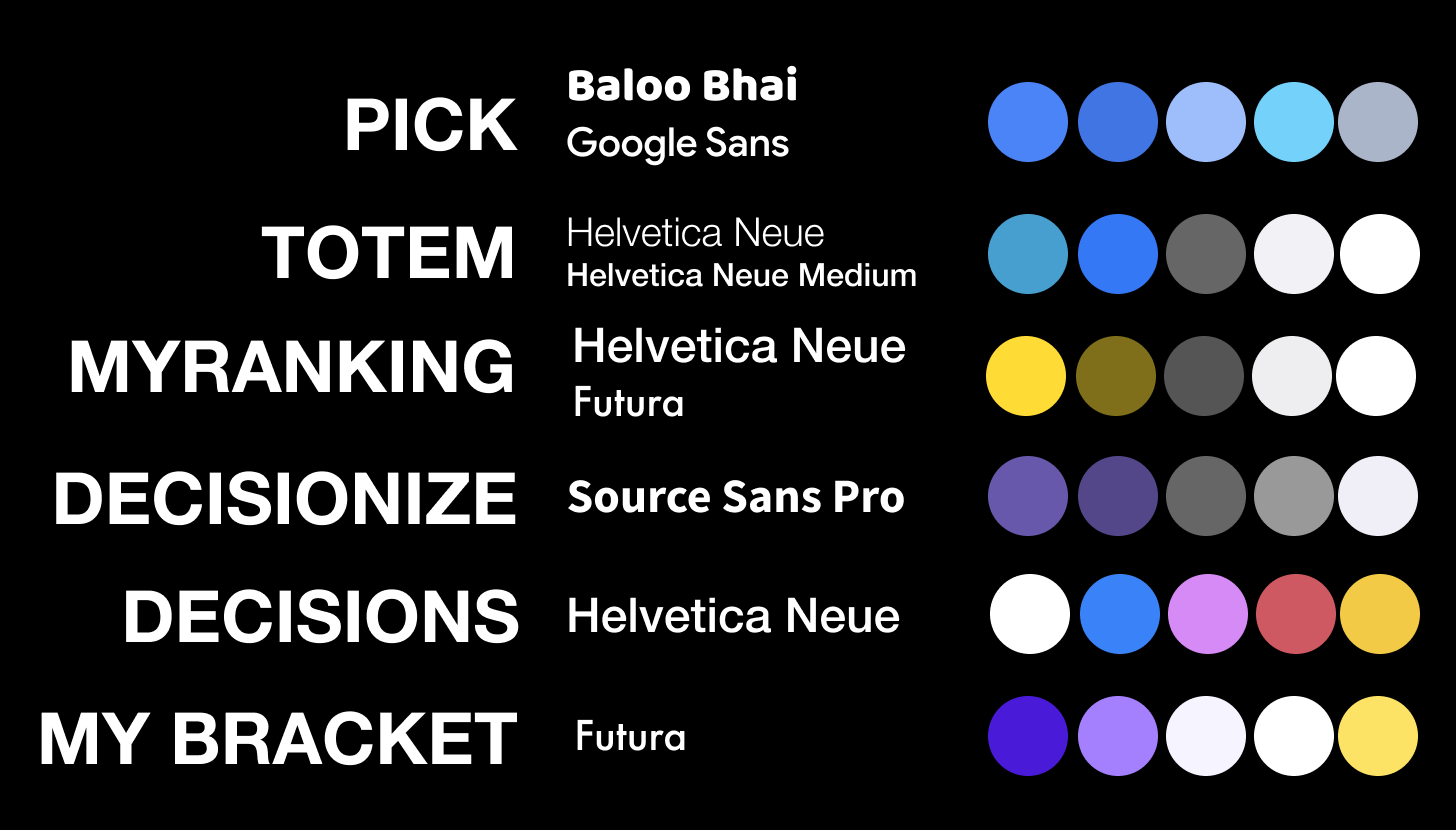
After receiving positive feedback on the low-fidelity prototype, I updated the visuals in a mid-fidelity varient. Originally, I wanted to distinguish the app from the others by giving it a brand identity that felt “industrial” so that I could market it as a general decision-making tool. I used a neutral color-scheme and a default system font.
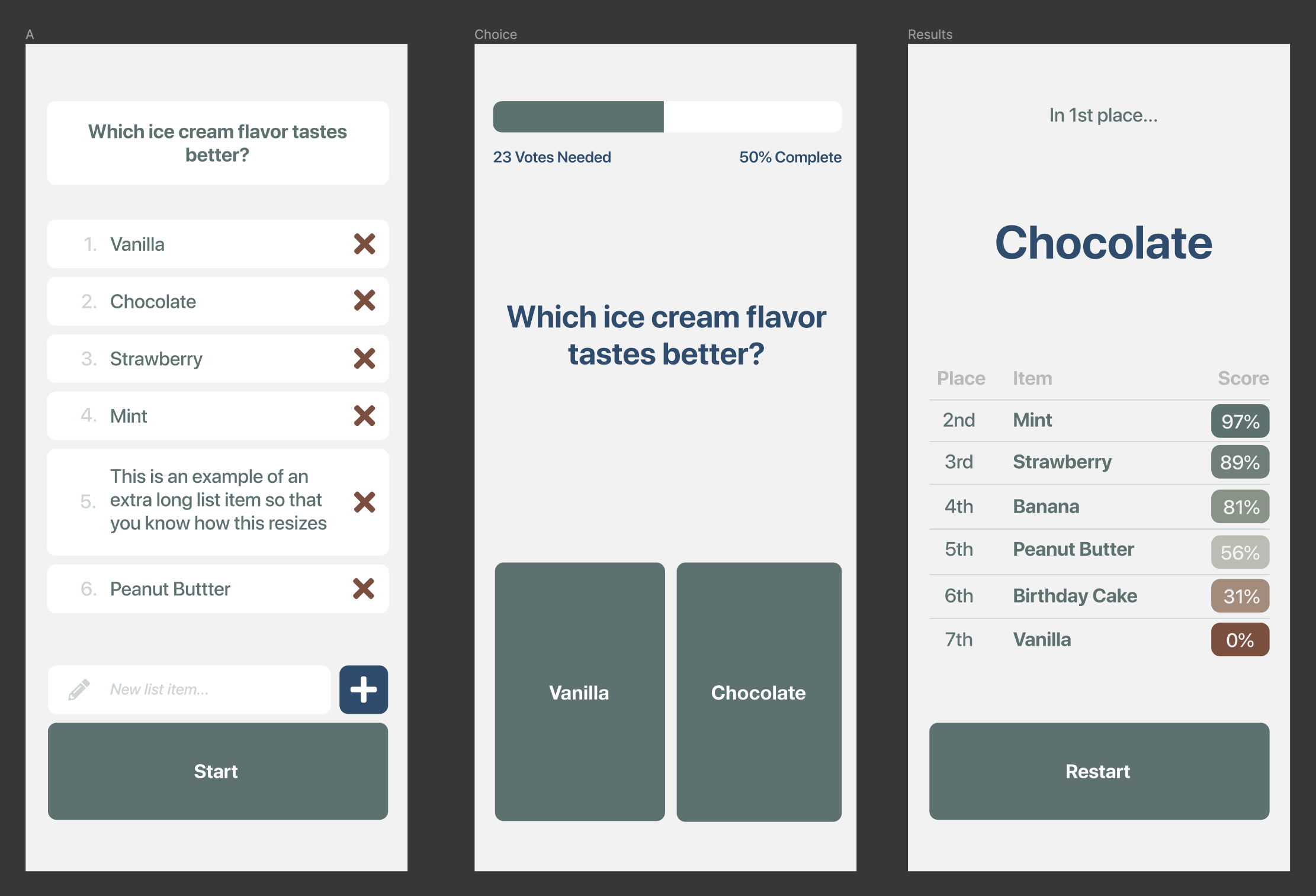
However, the mid-fidelity prototype received a lukewarm response. Most felt that the overall experience was fine, but that the app looked too boring. Users wanted the app to feel more “fun” – like a game to play rather than a serious tool.
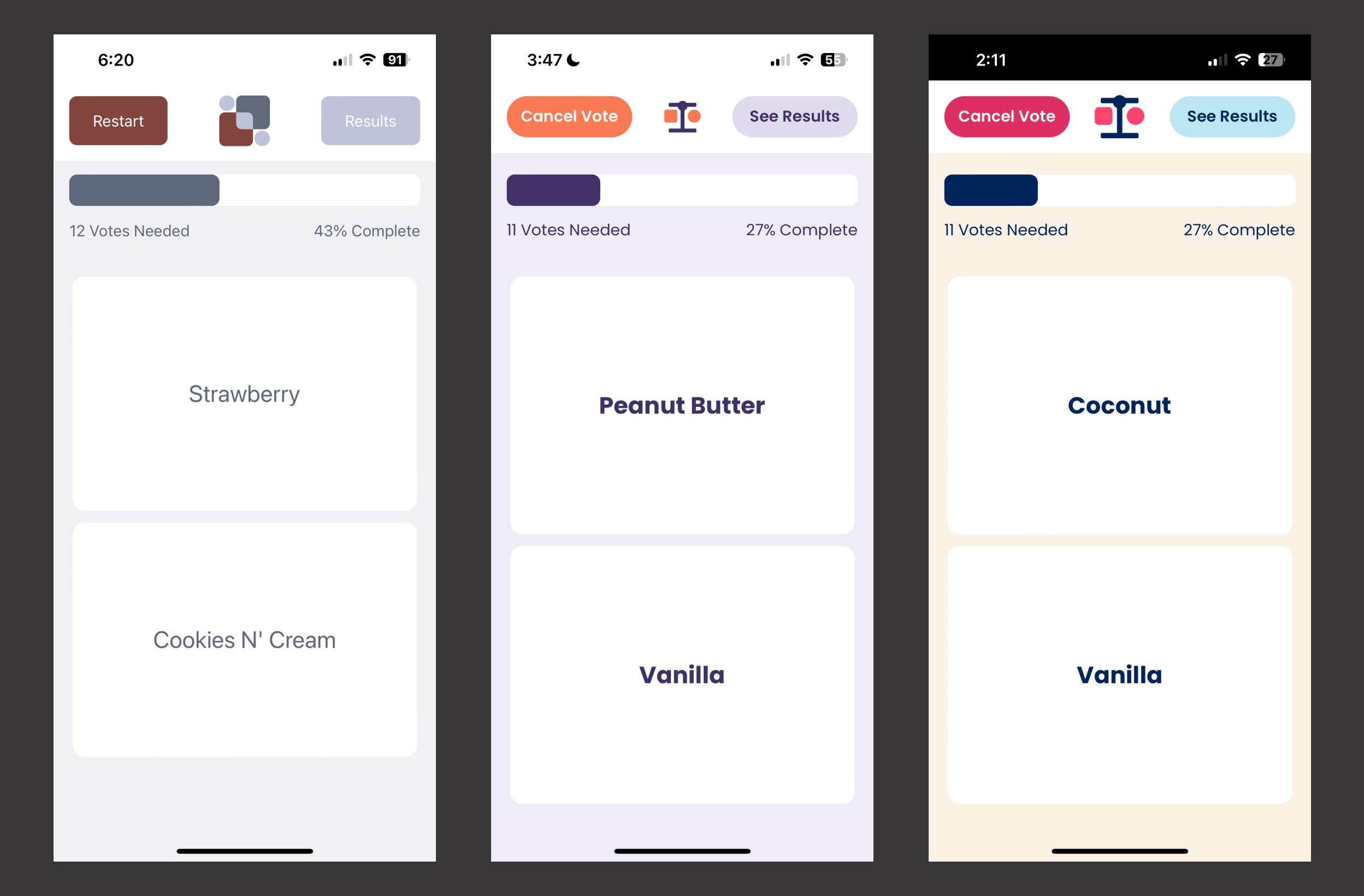
Based on this feedback, I built a high-fidelity protoype with reworked visuals. I updated the UI to be a responsive design that works across mobile, tablet, and desktop devices, and changed the branding to be soft and fun.
Solution
My ultimate solution was a simple and fun-looking web app that works across different devices. Creating and editing lists is fast and easy, and progress is saved for users so they can resume at any time.