Prompt Timer
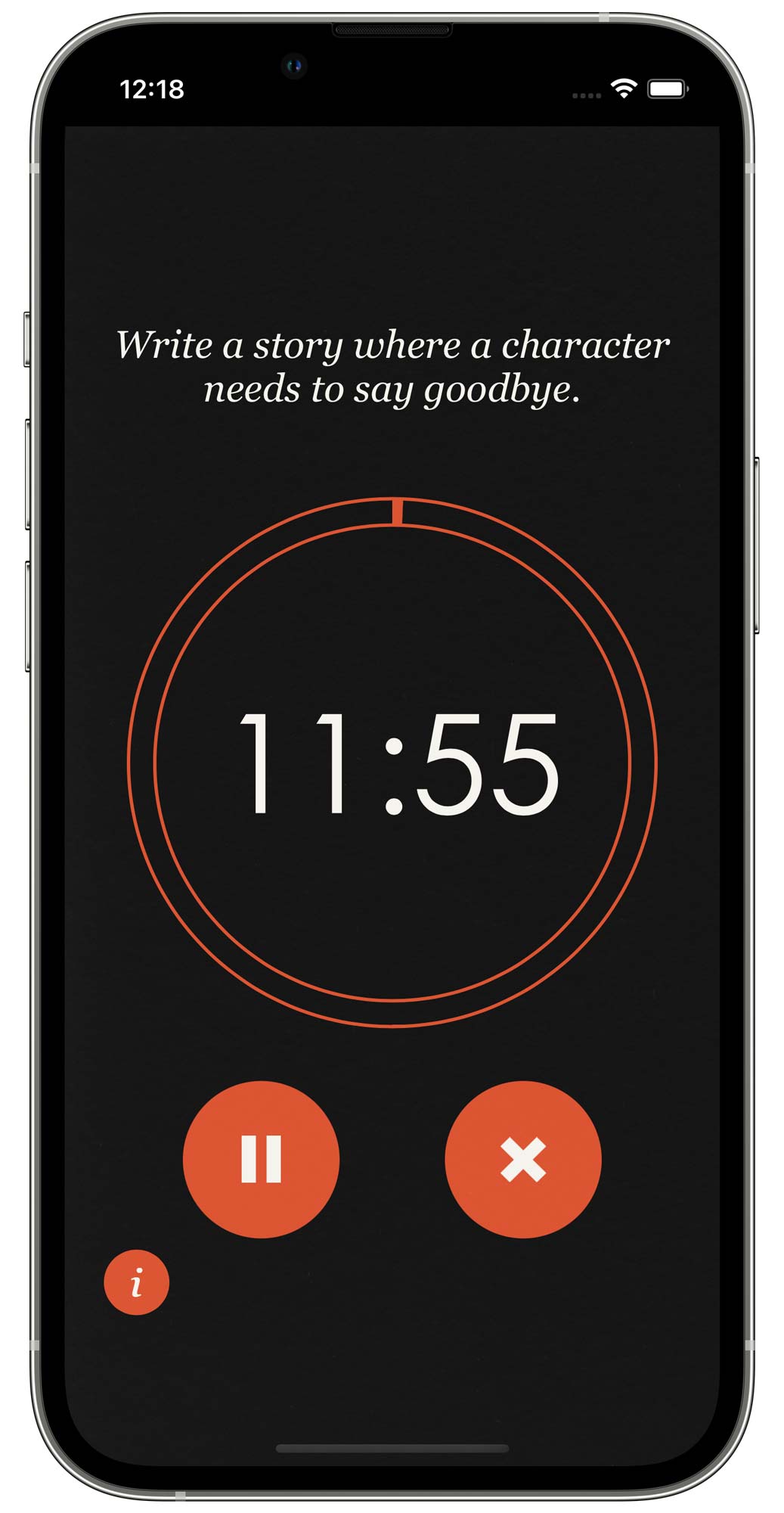
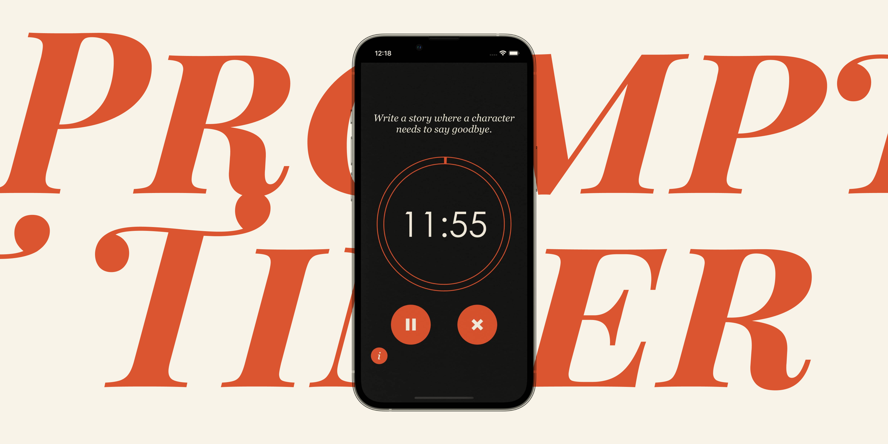
Prompt Timer is a web app that facilitates practicing creative writing by giving users a short challenge to complete. The timer can be set for any desired length, and when initiated will randomly select a writing prompt. The user can complete their work until the timer runs out.
Context & Challenges
Prompt Timer was my final project for a course I took on Interactive App Design. The goal was to develop an iOS-based web-app that needed a meaningful user input, incorporates cache manifest and local storage functionality, and overall be a polished final product. I had about eleven weeks from start to finish.
Process & Insights
I needed to learn how to set up a simple web app using HTML metatags and CSS media queries. I started by building a responsive web app that would change the content based on the phone’s orientation.
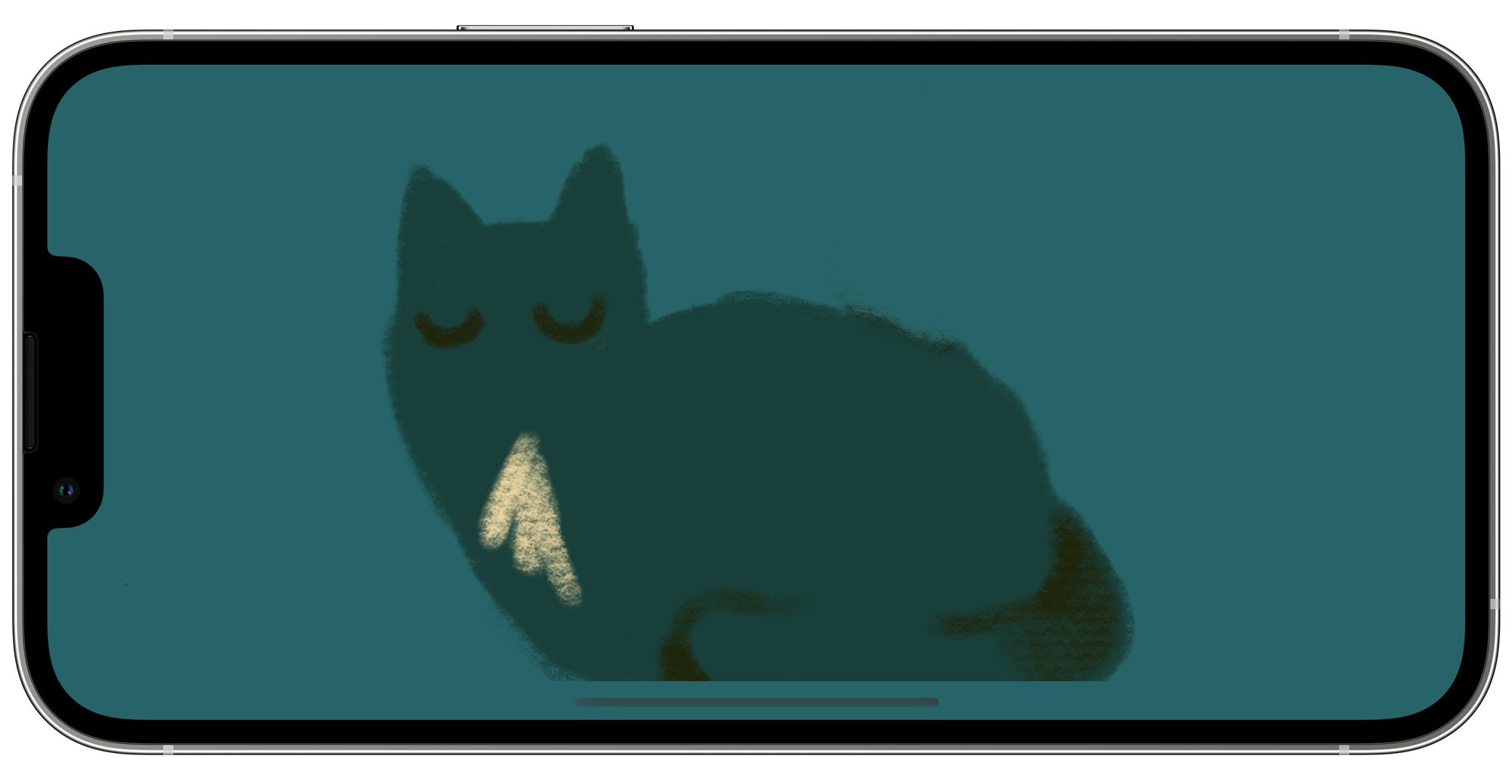
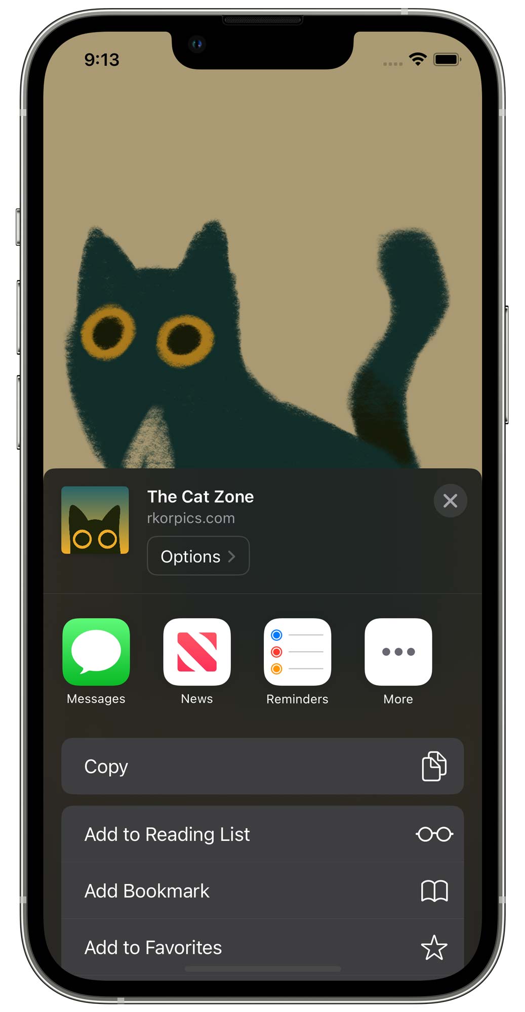
I added in a custom app title and a set of app icons so that it would display properly on the iOS home screen.
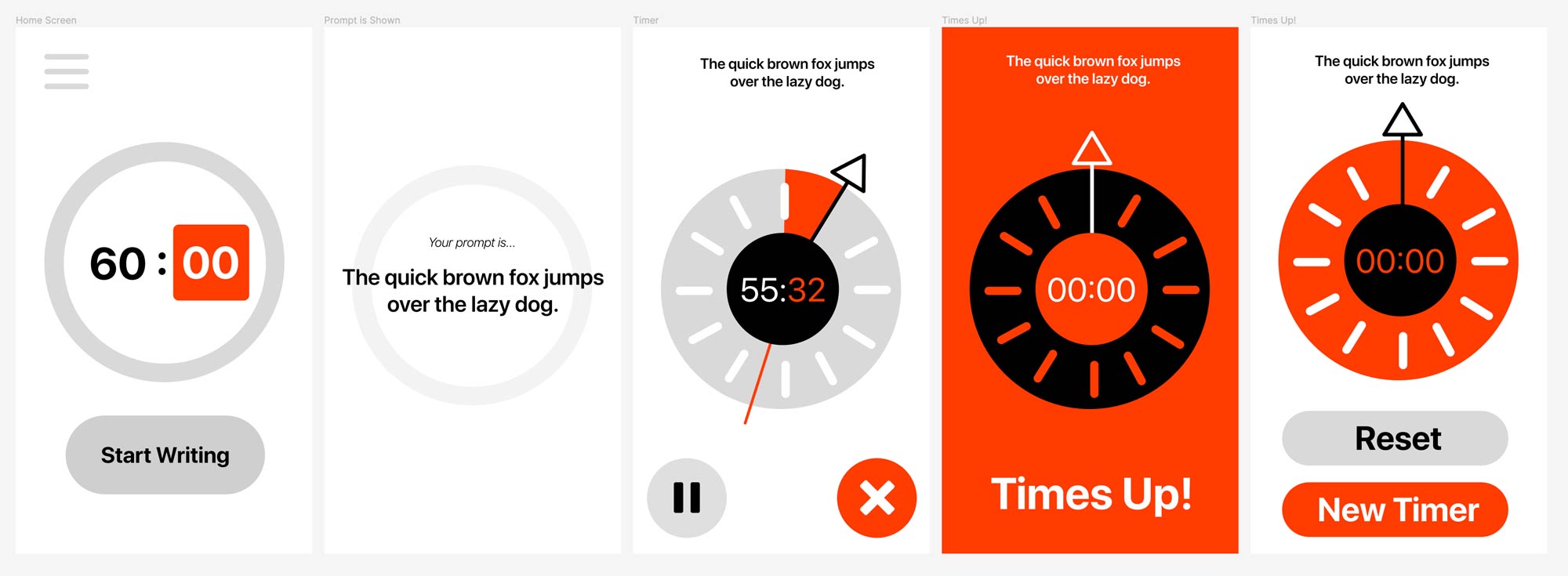
I designed a low-fidelity version of my app using Figma. Originally, I wanted users to have a lot more control over the app – namely the ability to specify the minutes and seconds they wanted to spend, and a menu for filtering the prompt.
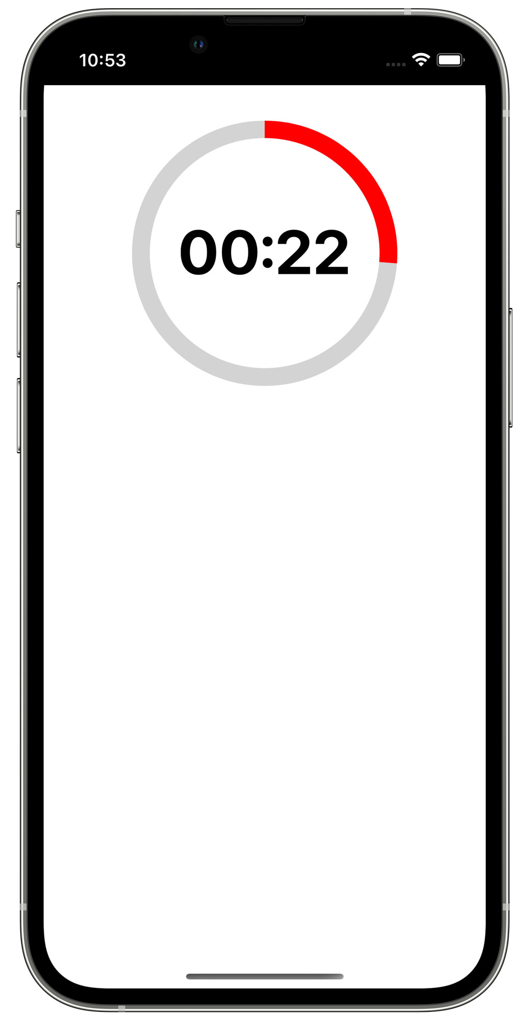
Once I had an idea of the app’s core functionality, I built a prototype of a simple 30-second countdown clock that would start with a button press.
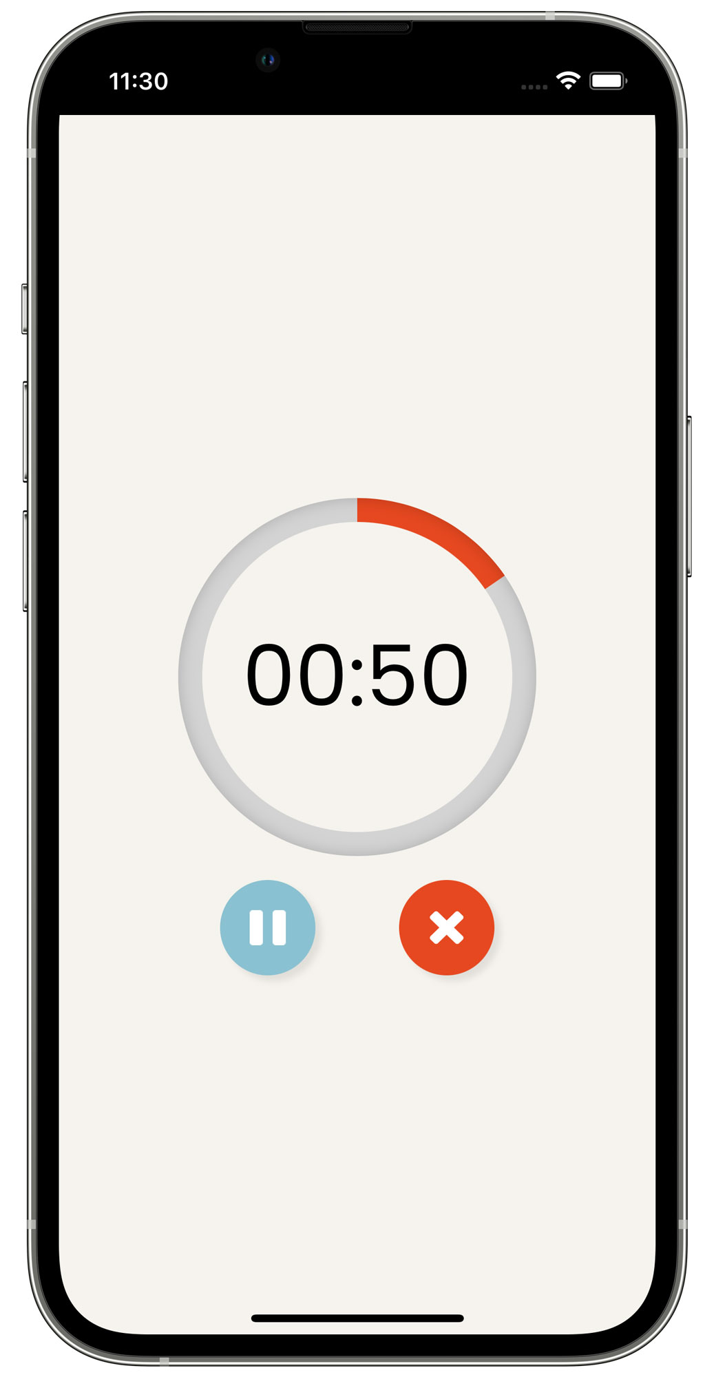
I added in the rest of the timer functionalities – user inputs for timer length, pausing, and cancelling.
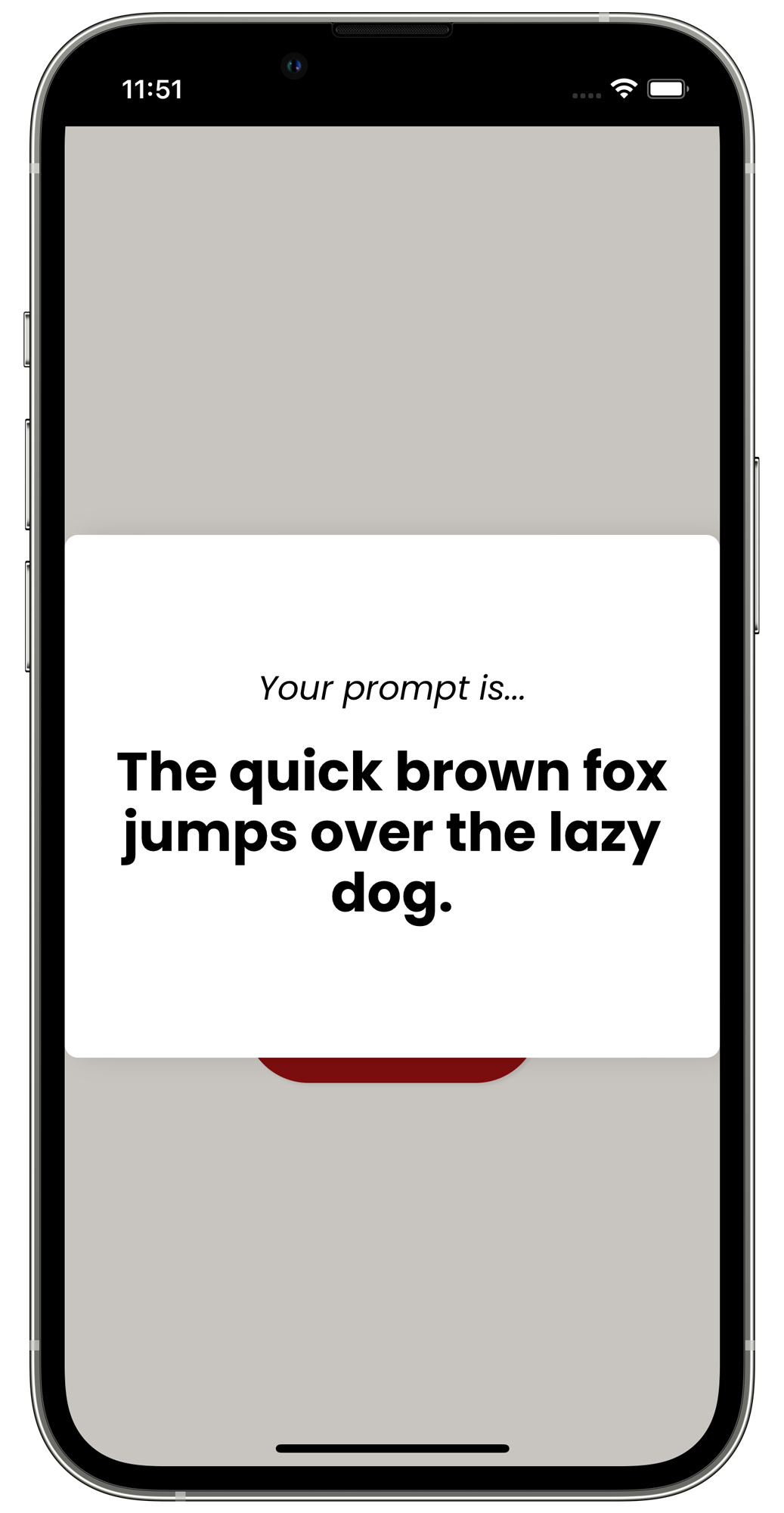
I added in a function that chooses a random prompt and displays it.
I tested a version of this with a few users who gave me feedback on the overall experience. I simplified the process by removing the input for seconds since it was too specific for users, and streamlined the process by cutting out uneccessary screens.
Solution
Finally, I polished up the UI. Inspired by various printed mediums, I decided to go with a flatter visual appearance but added in a paper texture overlay and various serif fonts to stick with the analog brand identity. I felt that doing this was a good compromise between a strong visual theme and a modern-looking interface.
