DUL UX Sharepoint
The Drexel University Libraries (DUL) UX Sharepoint is a site I developed during my co-op at the Drexel University Libraries. It is an internal site, meant to help communicate information about various team activities for library staff. I researched, designed, and built the website in its entirety over the course of several weeks.
Context & Challenges
UX at Drexel University Libraries is a subdivision of Client Access Experiences (CAE) focused on UX Research. As a part of my co-op, I was tasked with designing and developing a SharePoint site that communicates the UX Team's current work. In addition, it also houses a repository of data from earlier cases. I had about five months to research and develop it.
Process & Insights
To start, I wanted to get a better sense of the design problem.
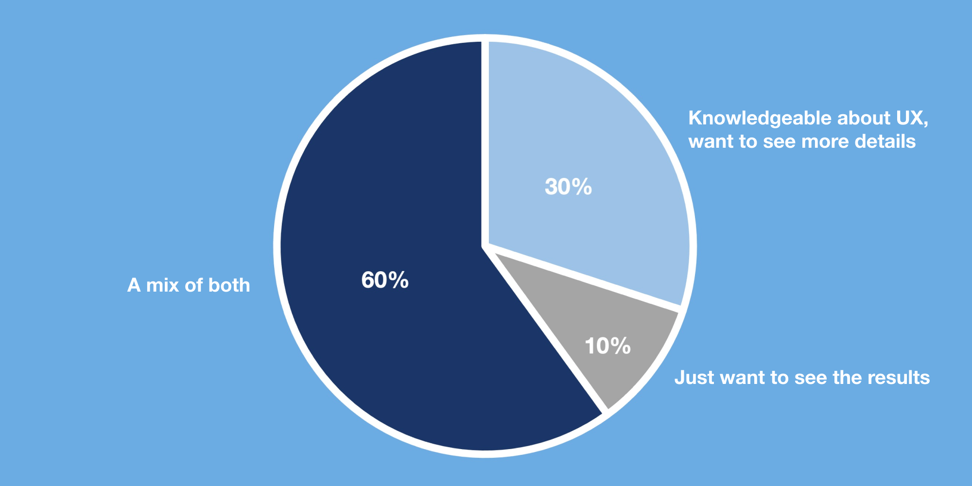
I asked the team who the key audiences were for a site like this, was told that it would be a mix between staff members who wanted to know the results of their research, and members who are knowledgeable about UX and interested in learning more about their testing methods.
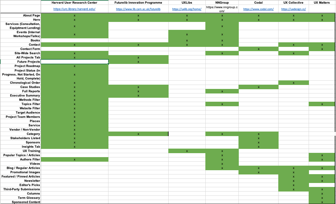
I ran a competitive analysis on similar websites to get a sense of the features and content that could be considered.
I performed a content inventory in which I cataloged all major projects that the team had previously worked on. I designed a structure for organizing all of the data.

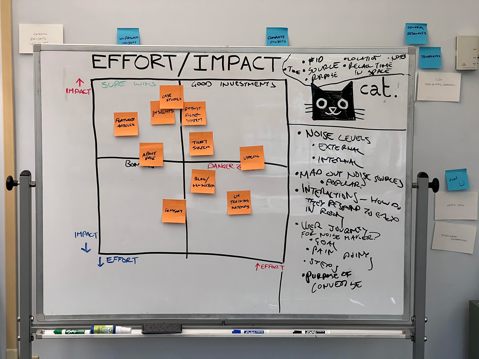
I used an impact/effort matrix to help determine my feature list for the project.
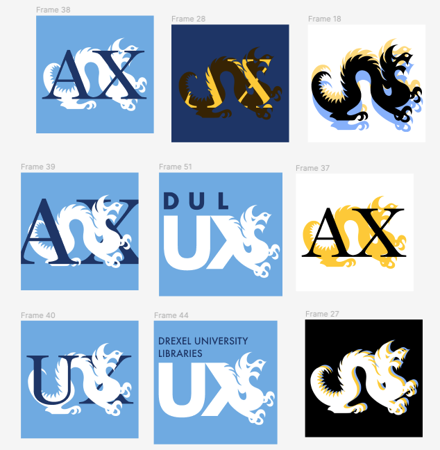
Finally, I started building out the site. Although SharePoint does not give its users extensive control over the final design, it does allow admins to customize the site's branding, content, and layout. Based off the Drexel University Libraries design system, I created a brand identity for UX at DUL that was meant to communicate how UX is both scientific and empathetic by focusing on softer blues.

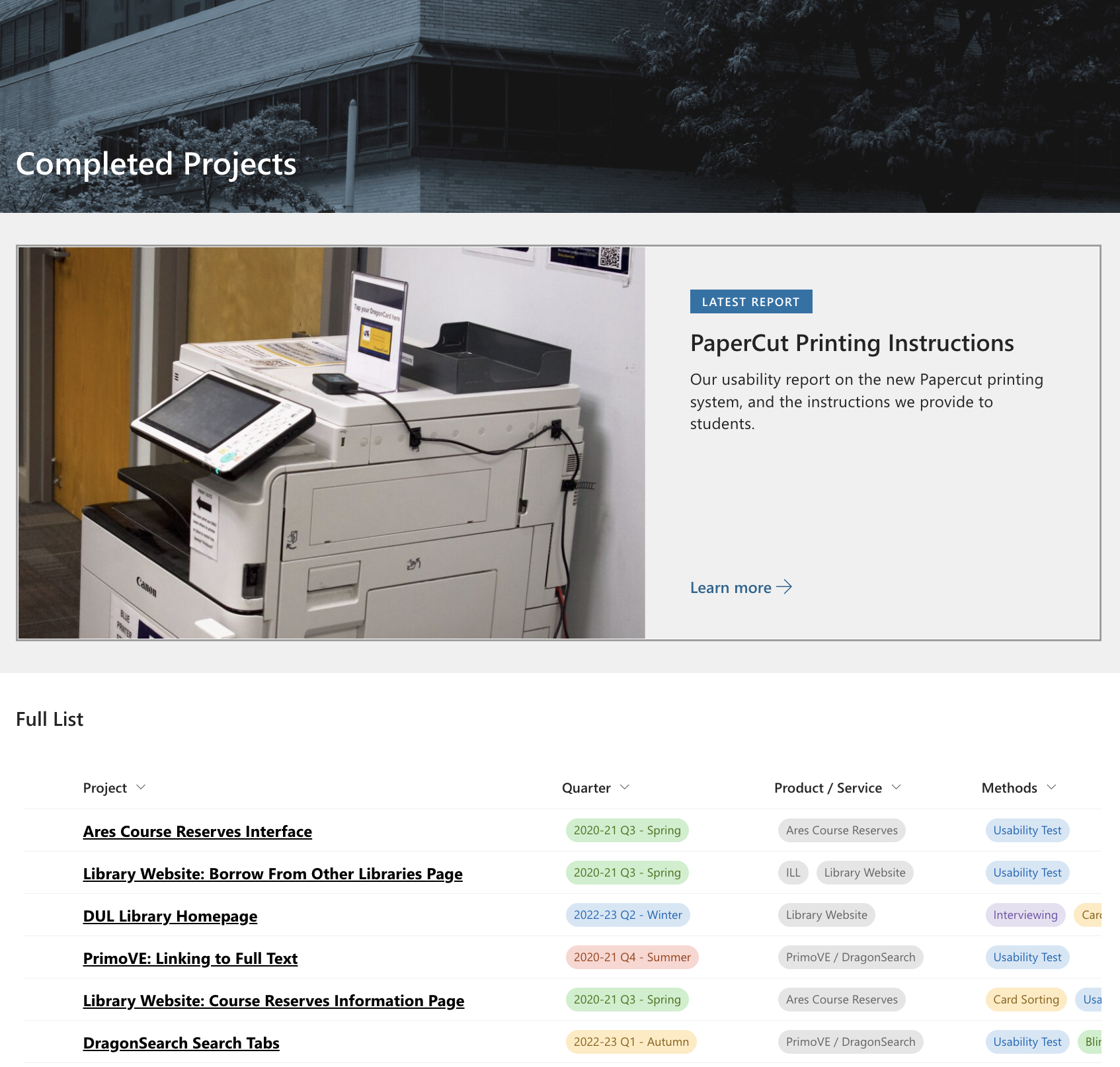
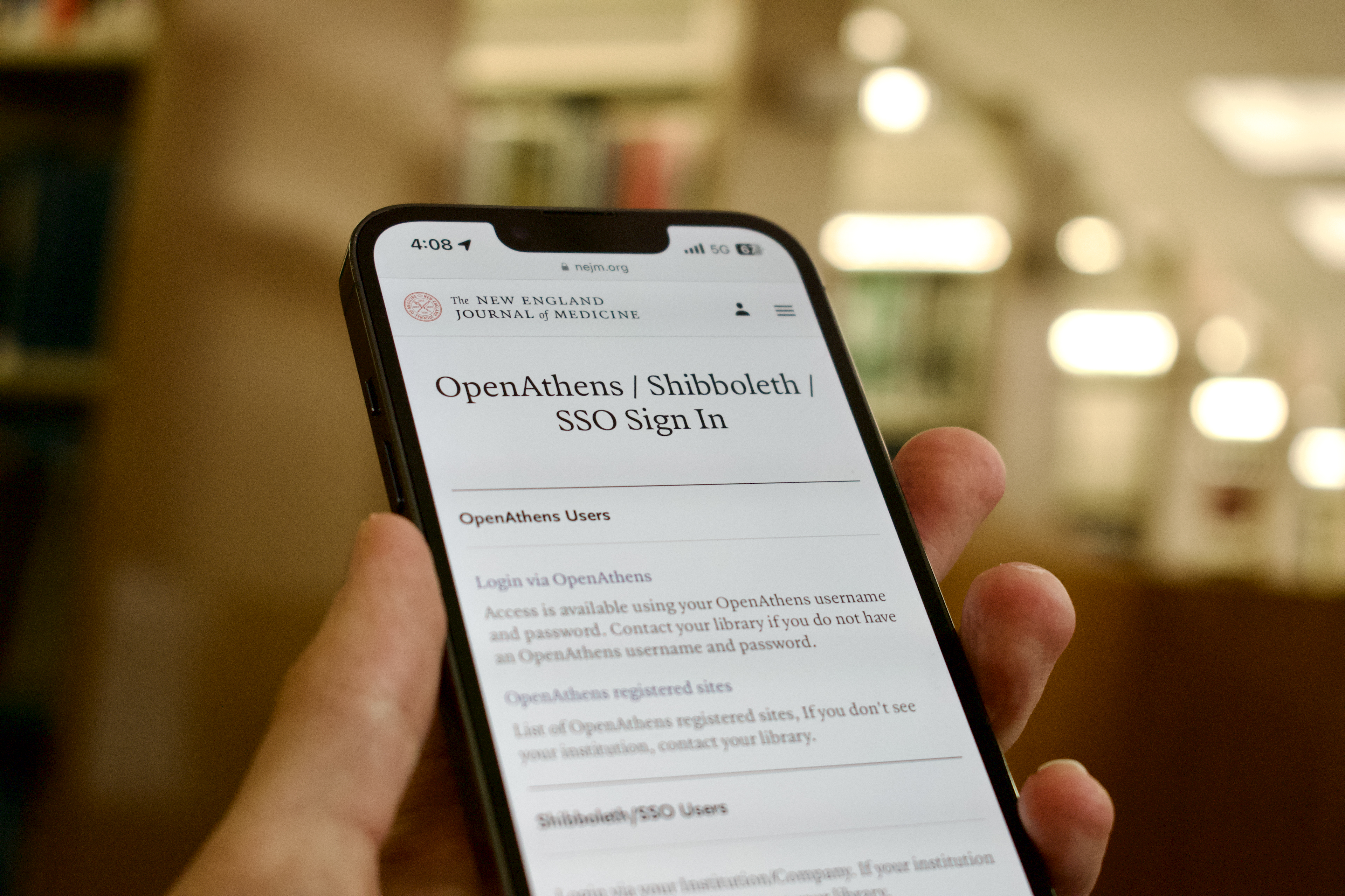
With input from the team, I wrote dozens of pages that summarized the major projects I identified, as well as compiled all files discovered during the content inventory that were related to each one. I also took a couple of days to photograph hero images for each of these pages.
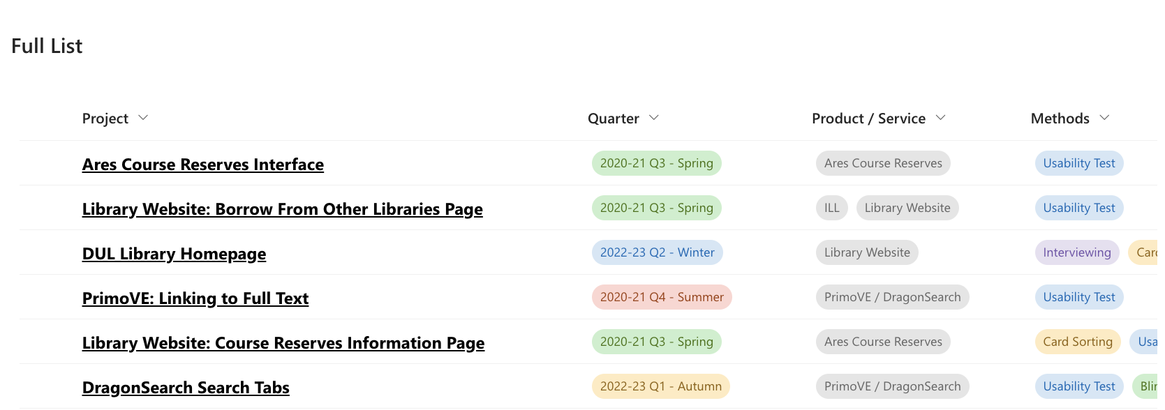
To help navigate, I made a SharePoint list that categorizes each link based on the date the team worked on the project (expressed in university quarters), the product or service being tested (in case the name of the project was not descriptive enough), as well as the methods used (for those in the audience who are interested in the details).
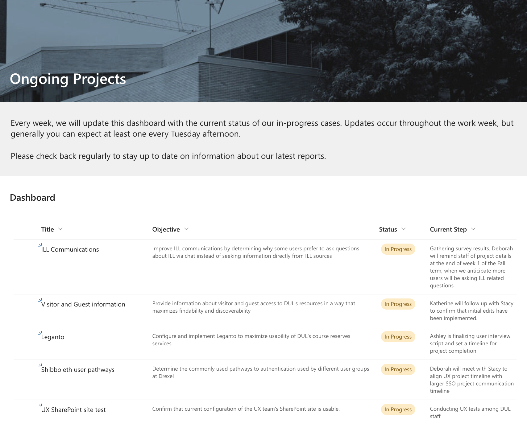
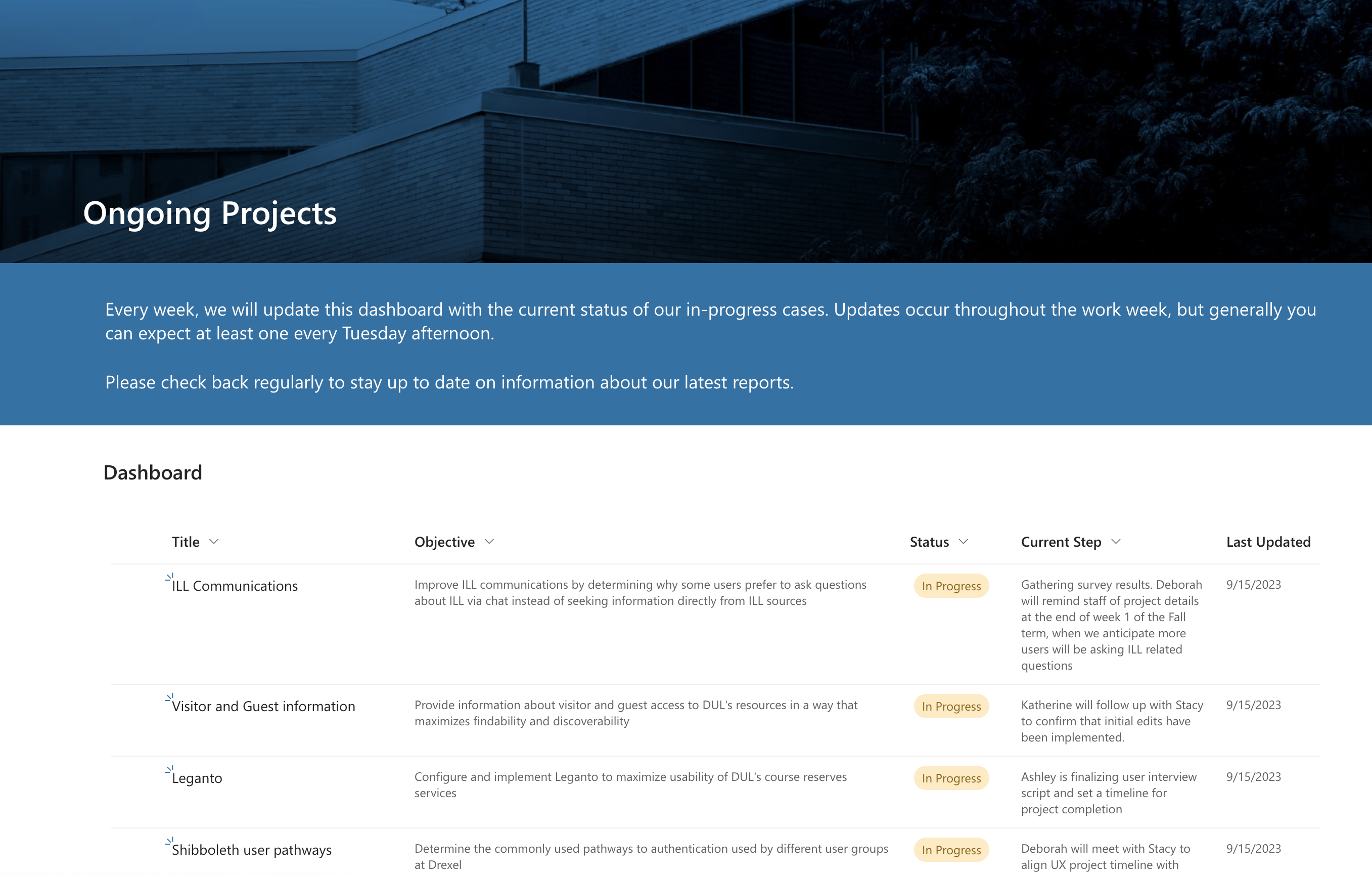
I also created two other SharePoint lists to serve as a dashboard to help relay the status of all current and future projects.
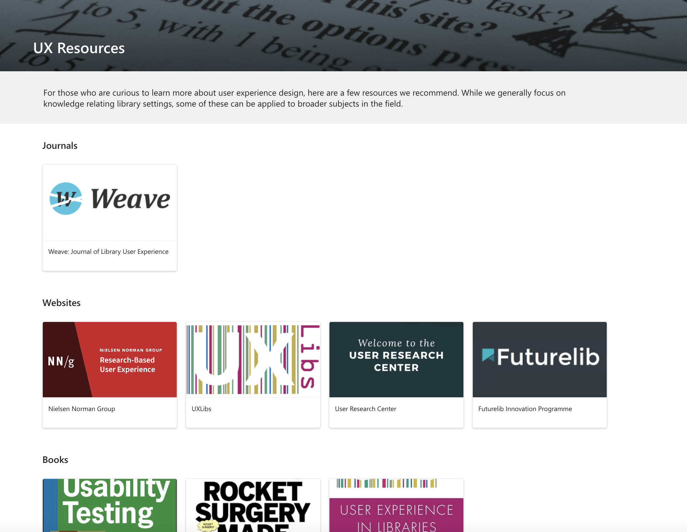
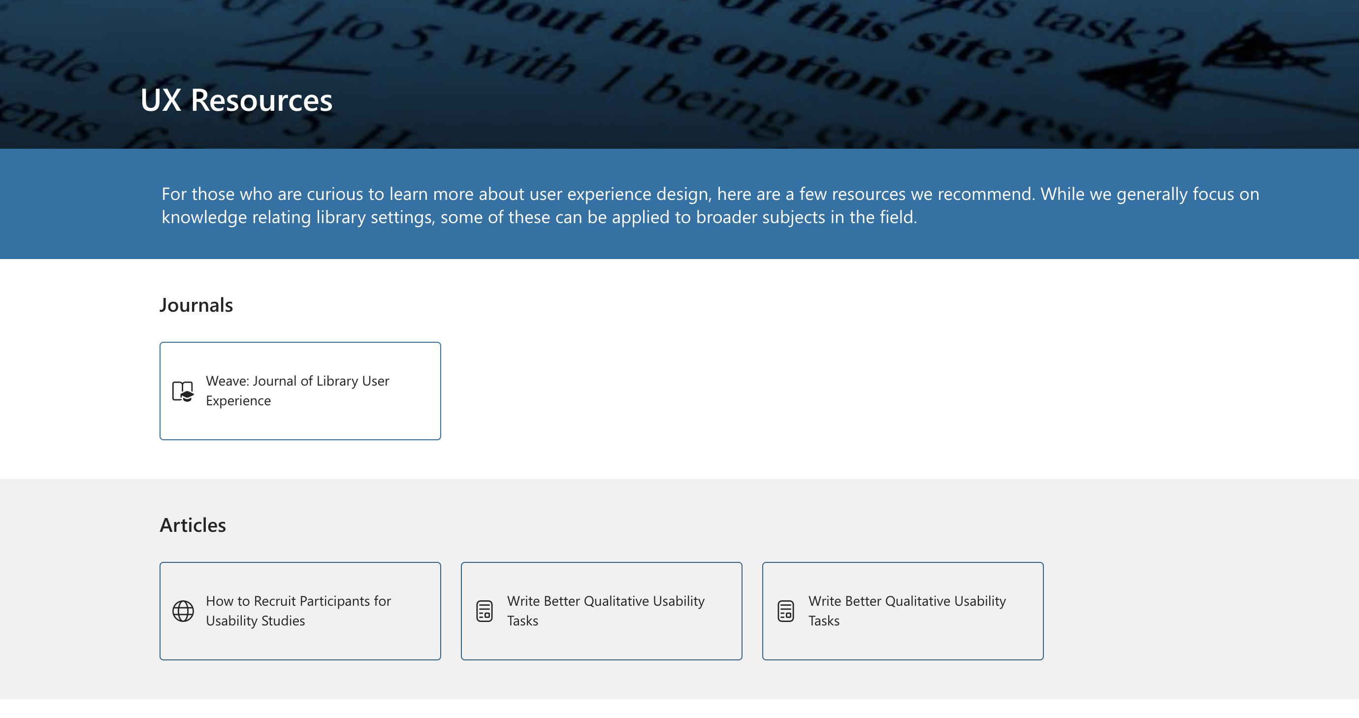
I added a few other features that I identified in my competitive analysis, such as a form for submitting new project ideas and a tab for compiling various academic resources related to UX.
Once the prototype was completed, I conducted a usability test among the staff members to see what needed to be corrected before going live. Because of the limitations of SharePoint, some problems could not be fixed since they were hardcoded into the program. Others, such as the placement of UI elements, the lack of clarity in some of the labels, and the desire to see more interesting and professional looking visual elements – were things I could address.
Solution
After considering user feedback, I updated the visuals to the best of my ability and created a useful and pleasant looking site that satisfied the needs of the CAE team.
