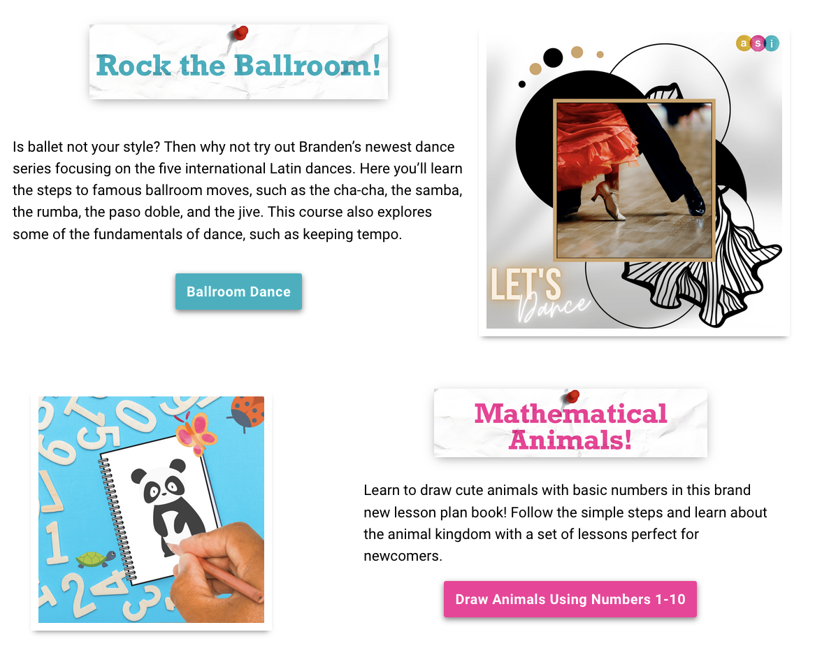
The ASI Bulletin
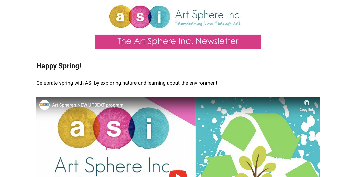
The ASI Bulletin is a newsletter I established during my co-op at Art Sphere Inc. It was monthly newsletter meant to highlight the latest activities, events, and volunteer opportunities for both kids and adults. It has since become a quarterly publication but has otherwise remained the same. I created the visual assets in June 2021, and helped design, drafted, edited, and published each installment from July 2021 to October 2021.
Context & Challenges
Art Sphere Inc. is a Philadelphia-based non-profit dedicated to making arts and education accessible to all children. The Executive Director approached me in late-May 2021 to rebrand their existing newsletter into something that could be more child-friendly while still appealing to adults. The design had to be something that worked within their pre-made WordPress template and could be recreated with minimal effort.
Process & Insights
I started by thinking of ways I could incorporate Art Sphere’s brand identity into the newsletter. I was inspired by the unique, mixed-media art style they use in their marketing materials, so I wanted to pitch an idea that plays off it.
After a brainstorming session, I came up with the concept of a “bulletin board” themed newsletter. I based it off my experiences in public schools, where they were often used to convey information to staff members while also appealing to kids through fun decorations. I drafted up a logo to share the concept.
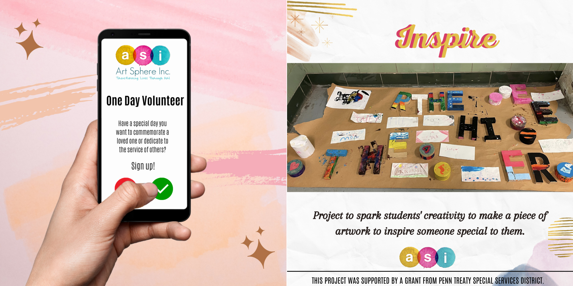
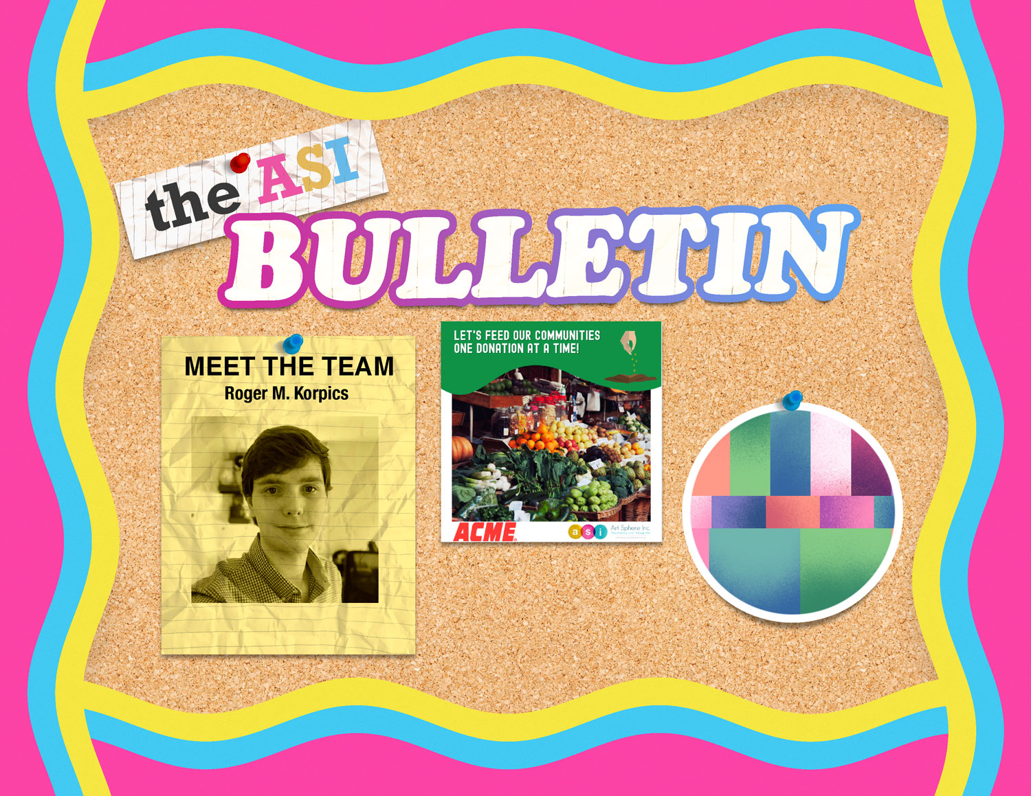
The Executive Director was thrilled about it and wanted to see it expanded upon. I produced another visual to help communicate the skeuomorphic design language I was hoping to use for the project and shared it with the team.
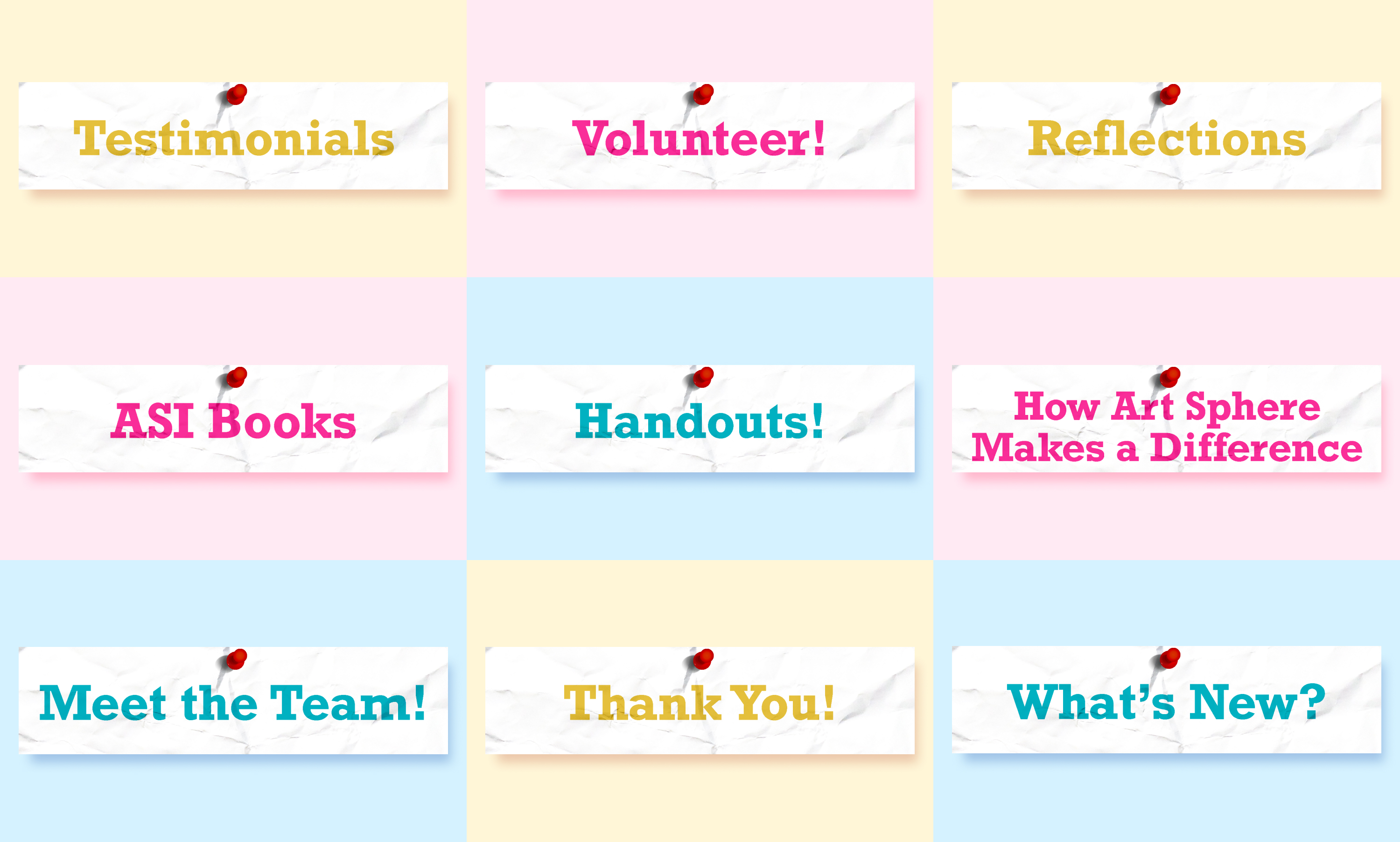
Again, the idea was met with enthusiasm – so much so that the team wanted to see the idea quickly implemented for a June release. I helped the writing team draft up the release, and then created graphics to use as section headers.
The time constraints prevented me from being able to fully refine the art style, so I look to create a proper style guide and template for it in the next release.
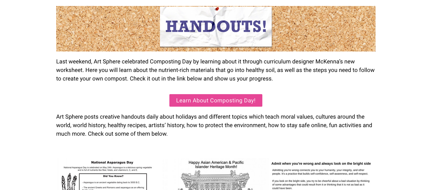
I created a template for the Bulletin Board, including drawing up custom assets and stickers to further decorate it..
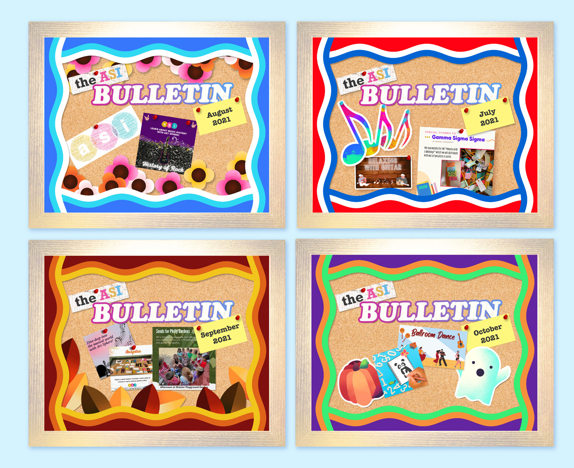
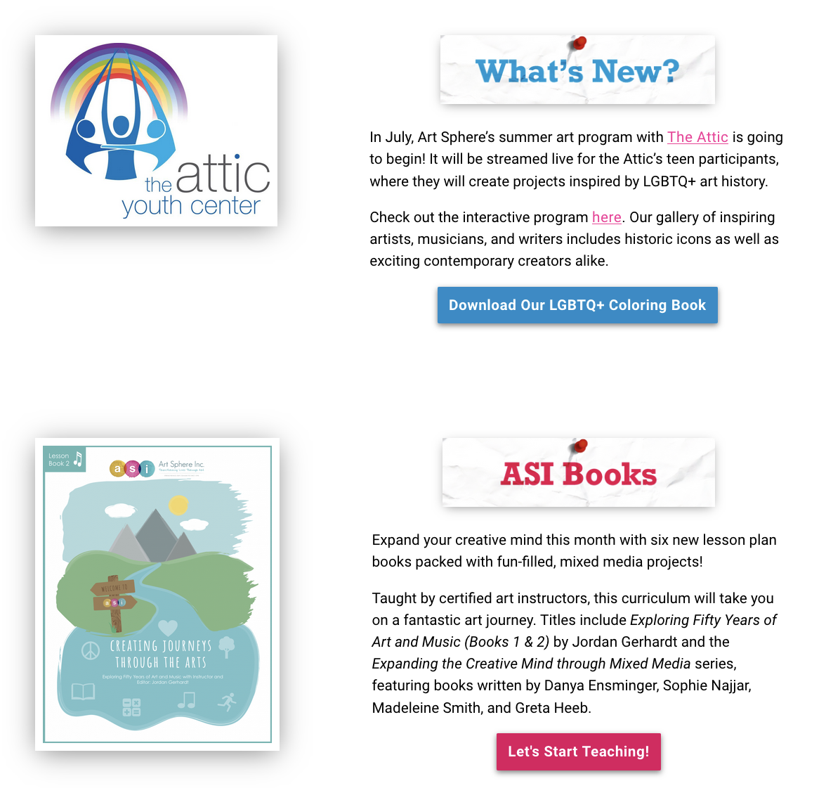
I also cleaned up the interface on the posts. I removed the corkboard texture to make it look professional, but I made a few choices to keep the analog material analogy.
Solution
After taking in feedback from the team, I updated the visual style to tone down the box shadows and match the ASI colors better. After I left the Bulletin received smaller tweaks from different UI designers, but it has stayed the same for these past three years.
